Case Studies
Educational Transformers Website
The project: Create a website to showcase innovations in education with emphasis on alternative school projects, and teacher and student stories.
My role: Responsible for the process of building the website and managing a team of specialists and contributors.
Challenge: Massive amount of material and information that needed to be presented online.
Decision: Engage all contributors and specialists in an active sharing of information and collaboration on the project.
Initial User Research
Based on initial user research - online and telephone questionnaires - I saw that educators and writers were eager to contribute their innovations and stories to the project. We collected information from them and organized an online group of educators to encourage their collaboration on the project.
Sketches
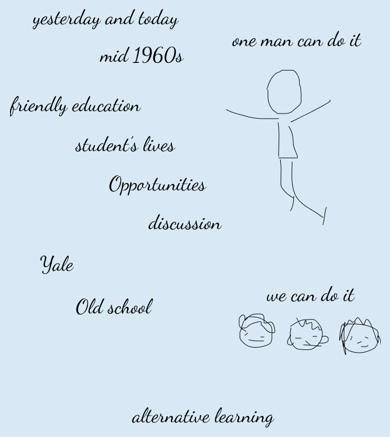
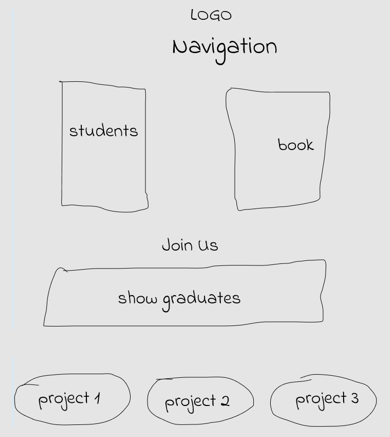
I created two dozen sketches at our brainstorming meeting. Each our team member produced between two and five sketches. I asked the team to choose which ones they liked more. We used the "first impression most important" approach when people were asked to look through the sketches very fast and then vote. The vote was anonymous. Three sketches were chosen. Two of them were mine. See them below.
Site Flow
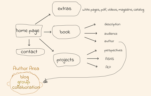
I suggested dividing all the information on the website into three main blocks: The Book, Projects and Extras. I also recommended adding the Author Area with a membership access. The author and members can contribute to an online digital assets library as well as to the blog.
Home page (version 1)
Mockup
The first approach I took was to build the home page around a "fat" header that included big bold title and two navigations. I decided to use oversized image-buttons for the main navigation. The navigation provided links to projects. I moved the secondary navigation to the top-right and coded it into a hamburger menu.
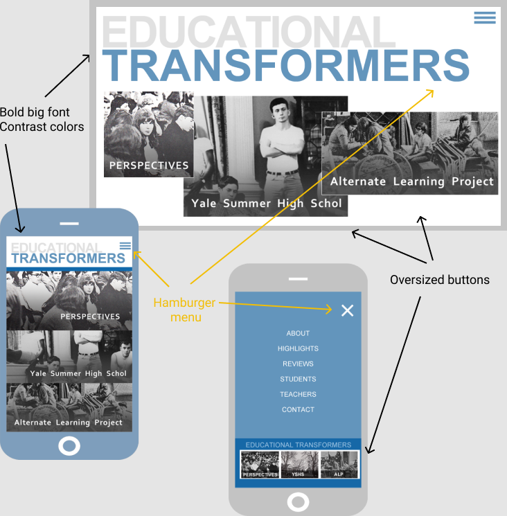
This approach created a clean and easy to navigate layout. It fit well on a page with a content based mostly on text but we needed more. The team wanted to show collages, images and a gallery on the home page. They also did not want to have a lot of text on the home. When I added collages, images and the gallery to the home page it became cluttered and confusing.
Home page (version 2)
Wireframe
I decided to use one navigation instead of two and a small logo instead of big bold text. I included everything into the navigation: links to three main projects and links to Extras as well as About, Book and Contact pages. I suggested deleting the blog link from the menu and moving it to the footer. We could also include links to an online community there.

Mockup
I have created a few mockups to show the benefits of using big images, collages, bold text and a gallery instead of only text and small images on the home page. Below you can see one of the mockups.

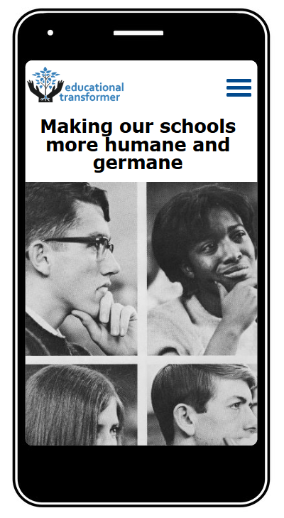
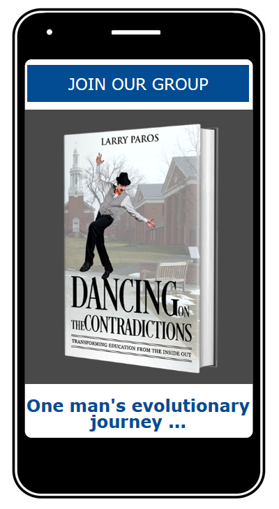
All images, collages, and the gallery I added to the home page made it very long. I found a clever solution - to use a parallax to create a scrolling effect as the user scrolls down the page.
You can go to a high-fidelity Home Page prototype to see the parallax effect.
Mobile-size screen
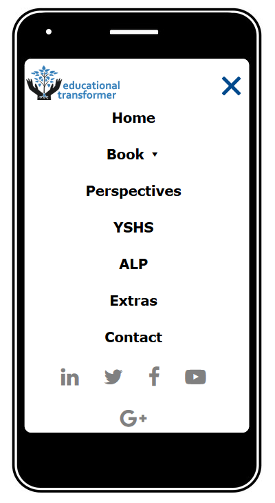
I used a hamburger menu and on-click overlay effect for a smaller screen. The parallax effect looks great on smaller screens.
Inner pages
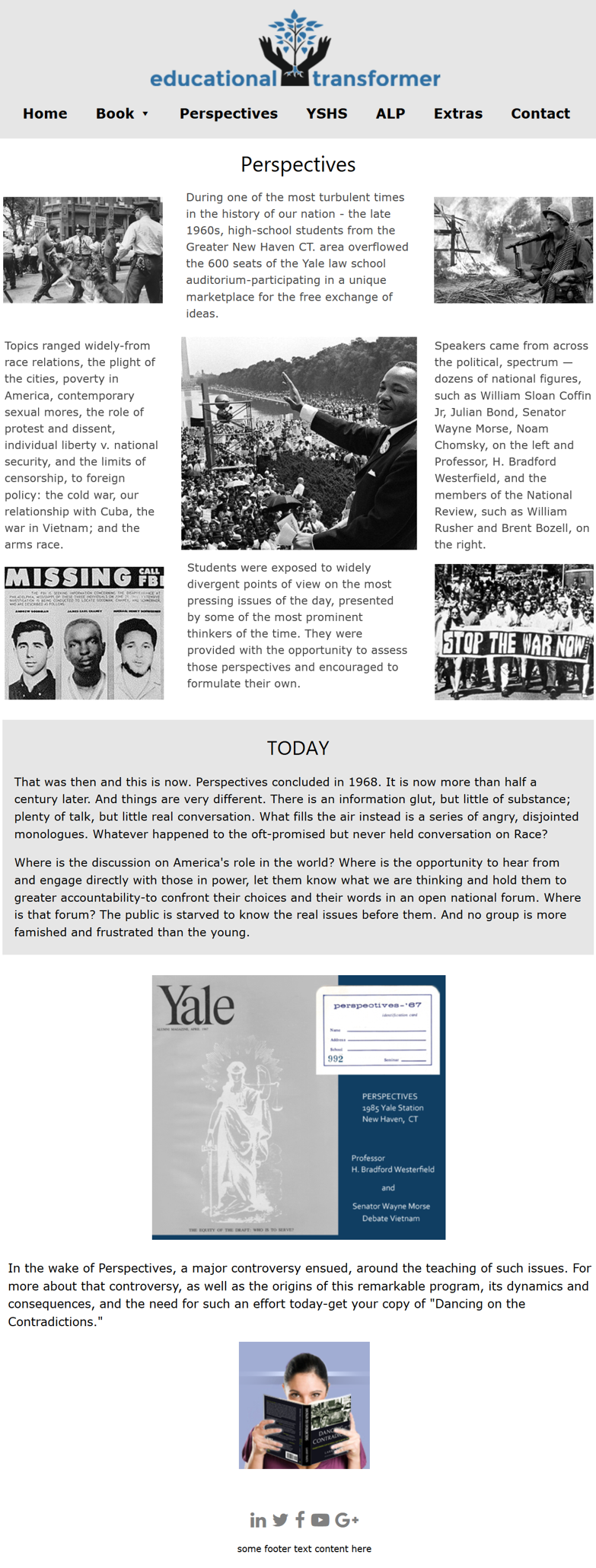
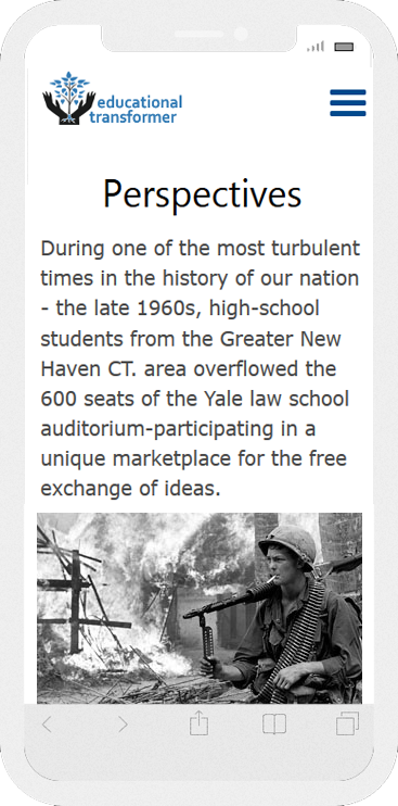
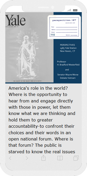
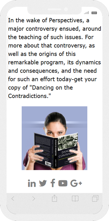
I used the same menu and parallax effect for inner pages. Below you can see my mockups for bigger and smaller screens.
Desktop-size screen
Mobile-size screen
ALP Catalog
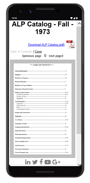
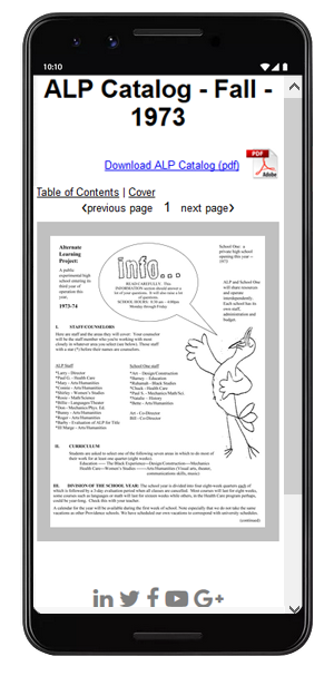
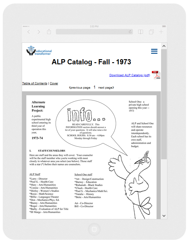
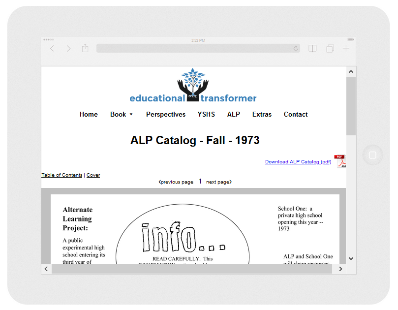
Prototypes for Different Devices
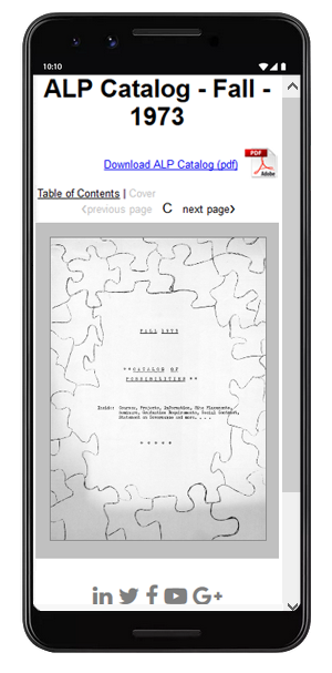
Android (portrait)
iPad (portrait)
iPad (landscape)
Online Community Login App
Goal: Simplify the registration and login for an online community of teachers and students.
My role: Lead user experience design and coordinate technical aspects of the project.
Challenge: Lengthy, confusing and not secure registration process
Decision: Provide different access for different groups of users. Protect access with Google captcha.
Login and Registration
Choosing Level
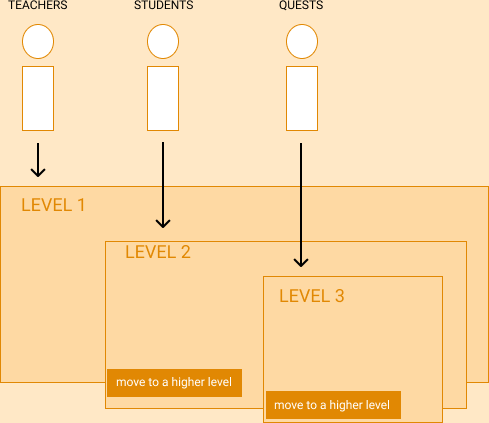
I divided users into three groups: teachers, students, and guests. This made it possible for us to:
- Create different levels of access and separate registration and login processes for each group;
- Provide different choices of activities for each level;
- Allow to move from a lower level to a higher level.
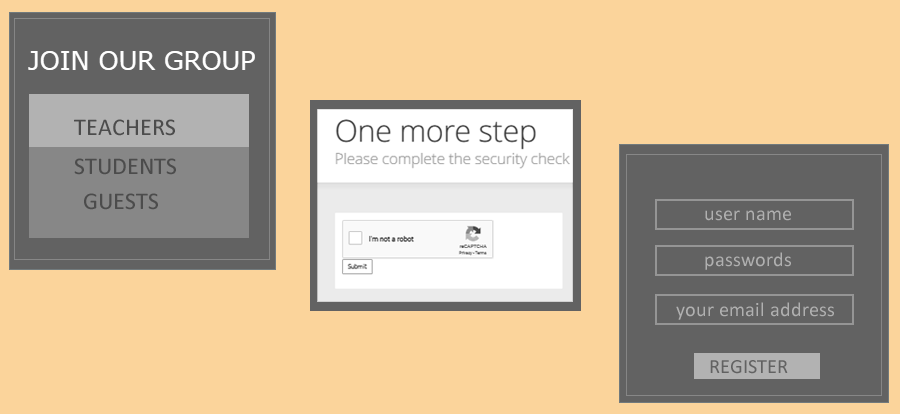
Registration with Google captcha
I used a standalone Google captcha. It enabled us to separate human beings from bots and request very minimal information such as a user name, password, and email address from a real user. It reduced the registration process from two pages with eight questions to one page. The process of registering became faster and easier to complete.
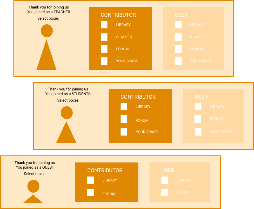
New Users Panel
I assigned different levels of choices to people: a larger number of digital assets (books, videos, articles, etc.) for the level 1 audience (teachers), fewer for the level 2 audience (students), and minimal for the level 3 audience (guests). User from anh level could choose to contribute to the whole community and request to move up the level.
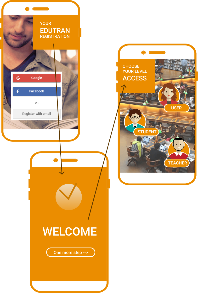
Mobile App Version
Single Level Version
We decided to postpone a full version of the online community until we built a complete digital assets library online. I suggest keeping only basic features for users while add more marketing capabilities, such as online newsletters.
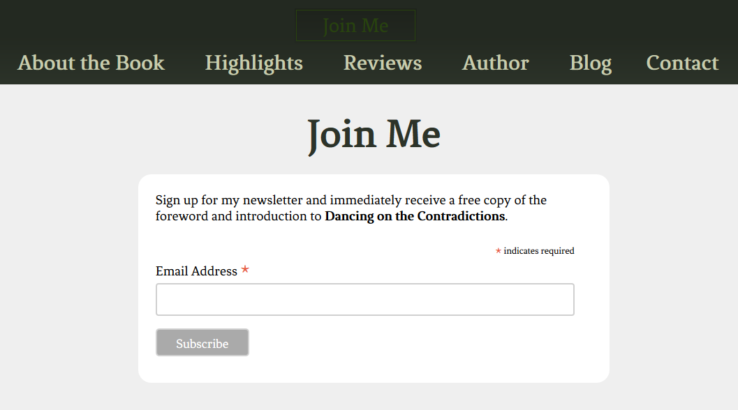
I deactivated a custom-made app with multilevel access and started using chimpmail instead. I created the "Join Me" button and placed it on a website's header.
Layout of the head with the button

Active "Join Me" form
After clicking the "Join Me" button, a user is directed to a registration form. I made it super simple: it only requires an email address. The information distribution software immediately sends an introductory email with links to the first e-books and videos and an access to a user's panel.
Instant Download
Goal: Allow buyers to instantly download their digital purchases directly from our website.
My role: Responsible for upgrading our old purchasing process to instant digital download.
Challenge: Lack of reliable and affordable digital download services, their not user-friendly interfaces.
Decision: Implement an instant download script directly to our website.
Instant downloading was unavailable on our website. We had to deliver the product by email to buyers, making our selling process less appealing to them. We tried a few digital download services. Their charges and processing fees consumed 30-40% of our sales revenue, and their shopping process interface was not appealing to our customers.
Instead of using a third-party service, I suggested creating our own digital download system. In addition to saving money, it will be more attractive to buyers.
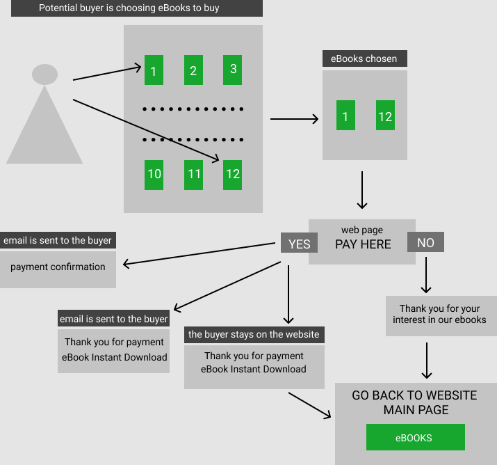
I created a flowchart to show the team the advantages of instant digital downloads. Our buyers can select one or more digital products and download them from our website immediately after they pay. The buyers were also emailed a download link. The team liked it, but we had to figure out how to add instant download capabilities to our website.
Instant Download Flowchart
I researched different methods of providing instant digital downloads directly from a website. I checked the paypal instant download button, WordPress plugins, and third-party services. All of them had their limitations. PayPal did offer instant download to buyers, but it was hard to prevent non-buyers from accessing the download pages. WordPress plugins didn't work well for digital downloads. The third-party services charged either a monthly or transactional fee or both; they also might charge for a storage area.
I found an instant download script that I could customize to meet the needs of our buyers and match the layout of our website.
I found a script that allowed an instant download from our website and also sent a download link and receipt to the buyer's email. The script was able to set an expiration time and block actual file locations to prevent not-buyers from downloading our digital assets. The script did require a license purchase, but the license was lifetime.
I installed the script and adjusted it to our products and payment methods. I coded our information into the script. The script worked flawlessly on our server with no major disruptions.
The Paying Process
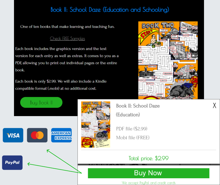
I was able to create a custom Buy Now button and add it to the Buy page. The script allowed buyers to pay with PayPal or major credit cards. The payment process was easy. It involved only two steps: click Buy Now and proceed to a payment page. The payment page looked like a standard PayPal that buyers were used to.
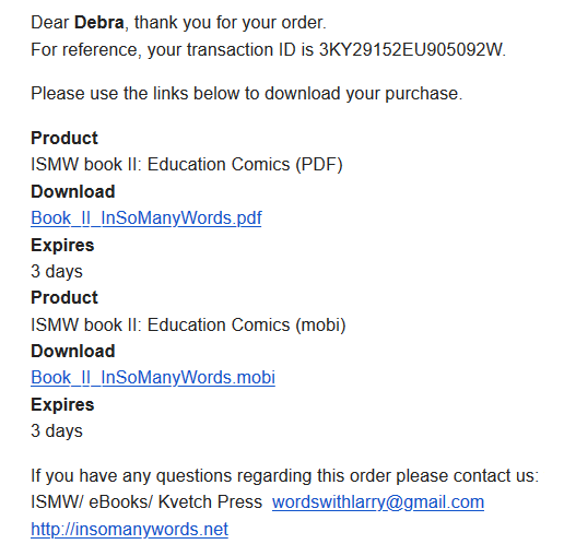
Response email letter with a download link
I hand-coded the response letter. The letter contained links to download purchased digital products and their expiration dates.
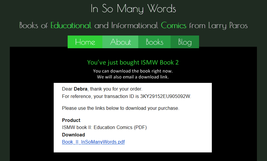
"Thank You" webpage with a download link
I designed and hand-coded a "Thank you" webpage with links to download the purchase.
E-commerce Medical Device

Goal: Increase online sales of cranial electrotherapy medical device, which had been decreasing by 35% each month.
My role: Responsible for the redesign of the website as well as increasing web visibility.
Challenge: The cesultra website was not mobile or user friendly. The company web presence was stagnant. Google ads ROI was two times lower than average in the industry.
Decision: Integrate the website's redesign process with the improvement of online presence and visibility
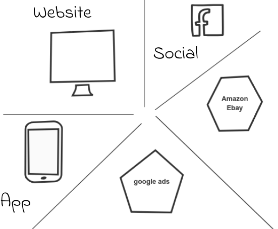
I encouraged our group to brainstorm ideas for how to distribute and deliver information about the new product online. Several dozen ideas were presented, ranging from a website and blog to a cool VR room to voice-activated apps. Based on both time and cost considerations, I chose ones that were more realistic. I organized them into five big groups: website, app, online marketplace, social networking and ads.
Website:
I evaluated the site structure and architecture and deleted unnecessary pages and links. I created website flowcharts, wireframes and mockups. I built templates, hand-coded them and optimized the code for search engines. I made the site responsive and adjusted it for mobile. I also worked with a subcontracted programmer to improve and implement the ces shopping cart.
I installed wordpress on our server and added a blog to the new Cesultra website. I adjusted the blog design layout to match the ces website's look and feel. I provided online workshops for contributors to show them how to use wordpress blogging features.
UX Outcome
- Simplifying the site structure and deleting unnecessary pages and links made the site look cleaner and easier to navigate even though we added more scientific research and data about the product
- Using brighter color palette for the layout and shopping cart buttons increased conversion by 10%
- Making the site mobile friendly boosted the site ranking, increased organic traffic, and allowed a room for shopping ads. Only after we adjusted our e-commerce pages to mobile, Google and Bing approved our shopping ads. Shopping ads of product listed on non-mobile-friendly pages are not allowed by the search engines.
- The blog's articles with big bright images, infographics and longer text brought more interest and clicks.
Social Networking
We expanded the cesultra web presence by adding twitter, facebook, youtube, slideshare and pinterest. I coordinated the ces social media activities. I also created and provided visual elements and digital materials for the social accounts..
Maintenance:
The ces site needed ongoing maintenance. I created a special panel that allowed the team to evaluate and support the website's performance by utilizing google, bing, spyfu and other web tools. I monitored the site by using google and clicky web analytics. I updated the site when needed and worked with a server team to support and streamline ongoing site performance.
I monitored the CEC social media accounts and the blog. I organized a centralized system for distributing and managing content online.
Ad campaigns:
I was tasked with finding and contracting specialists who could evaluate and enhance our google search ads as well as add new marketing channels. I coordinated the work of the contractors. I managed Facebook and Quora ad campaigns. For the ads accounts, I also created visual digital material.
I created and implemented google and bing shopping ads. The shopping ads became our main source of online sales.
I monitored the ad campaigns, provided analysis and suggestions.
RESULT:
Redesigning the website and adjusting to mobile resulted in 40% of increase in traffic and 30% of increase in sales
Adding a blog to the CES website further increased the site traffic by 10%
Google shopping ads brought an additional 20% increase in traffic and 35% increase in sales
Social networking was bringing between 10-20% increase in monthly traffic and a slight increase in sales
The company website traffic increased by 80-90% and online sales increased by 90-95%.
UX Outcome
- Simplifying the site structure and deleting unnecessary pages and links made the site look cleaner and easier to navigate even though we added more scientific research and data about the product
- Using brighter color palette for the layout and shopping cart buttons increased conversion by 10%
- Making the site mobile friendly boosted the site ranking, increased organic traffic, and allowed a room for shopping ads. Google and Bing disallow shopping ads of non-mobile-friendly websites
- The blog's articles with big bright images, infographics and longer text brought more interest and clicks.