UX Design
Preparation
Preparation phases may include many steps and elements, or a very few. This depends on the company's needs and resources, as well as the wants and expectations of the users. Below are two preparation schemas I created for projects with different scopes and resources. There is a smaller-scale schema for a product sale page and a larger scale schema for a university website redesign.
Small scale project

Large scale project
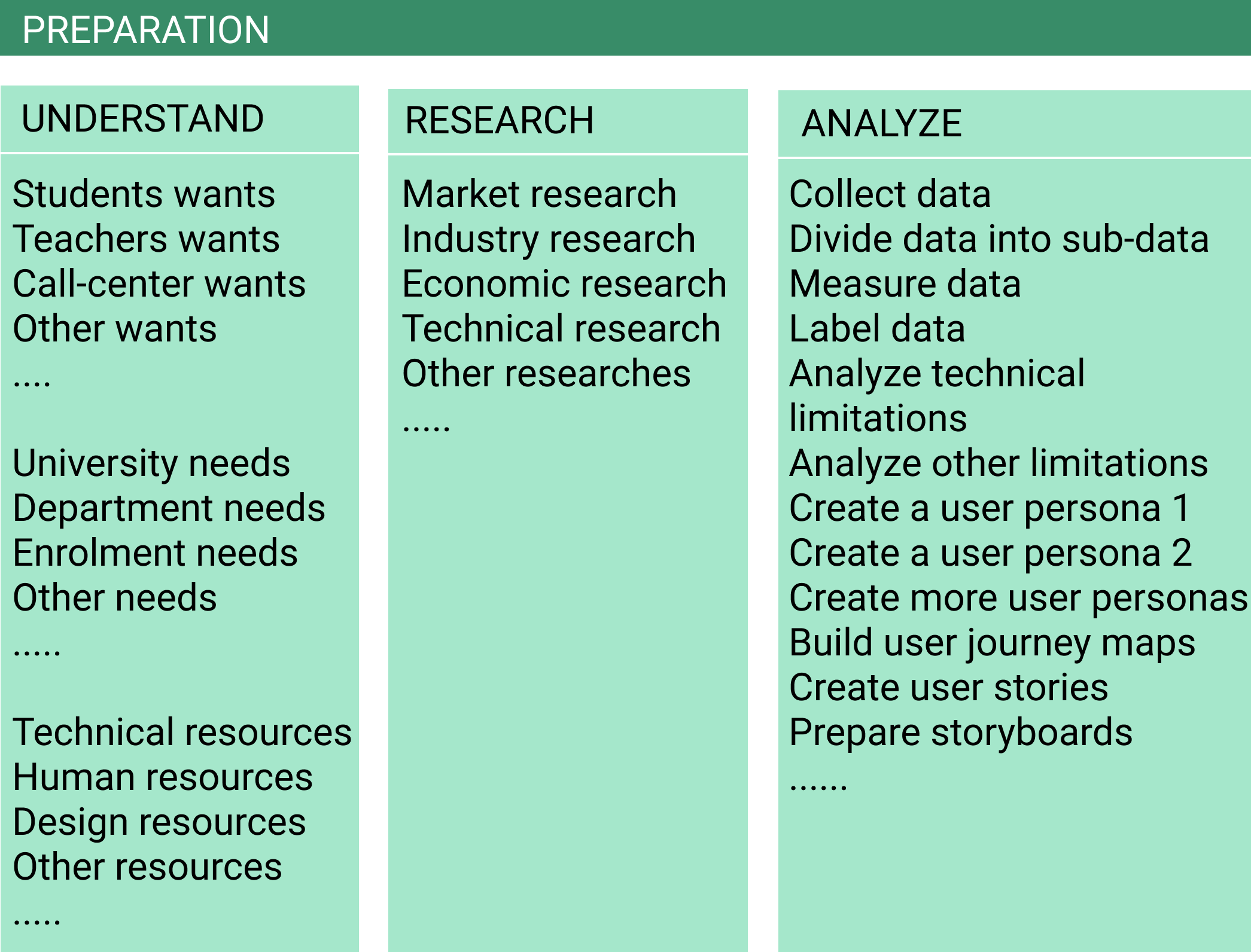
There is a noticeable difference in the volume of work. Redesigning a large website with multiple levels of architecture will obviously require more resources and time than a single "sale webpage". As an UX Designer, my goal has always been to find a balance between wants, needs, goals and resources.
In the Preparation phase, insights are derived from data collected during research and analysis to identify what a company and its users want and why. In my role as a UX designer, I ensure that during the Preparation phase, the team's most important assumptions are correct and ready for the next phase, the Creation.
Creation
I see the Creation phase of the UX Design process as a journey from a blueprint of a product - its information architecture - through logical blocks of design and functionality to the actual design of the user interface. Sketches, wireframes, prototypes, and mockups can be part of the Creation phase. The Creation can also include blocks of content, design guidelines, and digital libraries of components, patterns, and styles.
Importance of Content
In the Creation phase, I always stress the importance of working with content. In fact, my entire creation process revolves around the content. I divide the content into logical blocks, label and organize them in a hierarchy for further distribution. The distribution can be at the page level, the web site level, or across the entire web presence. It can encompass social media, blogs, online articles, wikis, web presentations, e-books, ads, etc.
As a UX designer, my main goal is to distribute the content in a way that makes it easy for people to find, navigate, and understand.
Importance of Collaboration
Collaboration is a key component of Creation. It can involve designers, developers, content creators, marketers and other specialists. Their communication and sharing form the basis for achieving their goal of creating a desired digital product. Based on my experience working on a variety of projects, I found that it is better to designate one person as the Creation coordinator. The coordinator will oversee the process, collect outcomes and coordinate the team efforts.

Sketches
Sketching is the fastest way to brainstorm and share ideas, so I never skip this step. I use sketches in order to better understand and pinpoint where we want the project to go at a very early stage. Below are some examples of my sketches.
Example: New Product Web Presence
I worked as a UX Designer for an e-commerce web site that wanted to add a new product to their listing. The product, Dynamic Vision Strobe Sport Training Glasses, just came to the market and was new to us as well to our customers.
At a brainstorm meeting I suggested moving away from a traditional e-commerce concept. The idea is to make products more visible online by bundling them together on a website to give customers more choices. I showed the team that we could market our new unique product differently. We could create an informational website specifically for these glasses. We could increase its web presence and online visibility by spreading the information about the product on social media, blogs, online marketplaces and search engines.
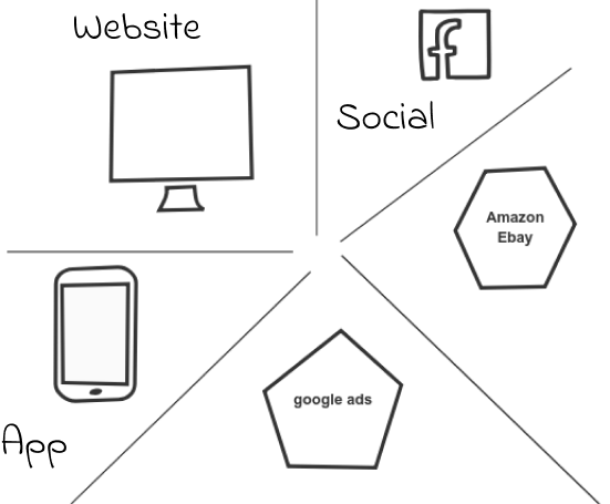
Our team created a lot of sketches showing different ideas on how to distribute information about the new product on the Web. I consolidated more than two dozen suggestions into five big groups: website, app, online marketplace, social networking and ads.
I came up with a few schemas to represent the website flow. The simplest version was approved.
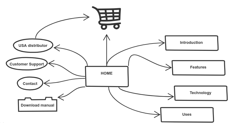
I suggested to use the first few weeks of moving the product online as a trial period. It allowed us to assess our web visibility features and promotion tools to find which would work better for attracting and encouraging buyers. In the trial time we could concentrate on the website and amazon marketplace. We could skip google ads and social media marketing. They are expensive and time consuming. We could add them later if needed..
In the process of creating the product web presence I found that we did not need to spend extra money and time on online ads and social networking. We also did not need a blog as a marketing tool. Our website quickly became visible online and attracted first buyers. Our amazon listing brought in first-time buyers in less than two weeks. I could attribute this to the uniqueness of the product, simplicity of the website and its search-engine friendly code that I had suggested and implemented.
We were eager to sell more products but availability became an issue. We sold all glasses we had and then took down the site and all web presences.
Wireframes
Wireframes are basic representations of initial product concepts, containing the essential elements that make up websites and apps. Wireframes outline website and pages structure, content distribution, information architecture, and overall direction. I use wireframes early in the development process to establish the basic structure of websites, apps and pages before content and visual elements are added. Below are some examples of my wireframes.
Example 1: E-books Archive
A book publishing company I worked for wanted to create an eBooks archive with a secure access for users. They would like to add the archive to their website. I created a few versions of the "Login-Join". They liked the one with the darker overlay block.
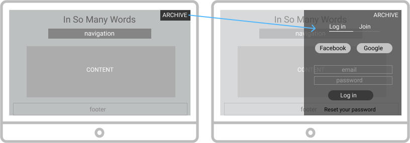
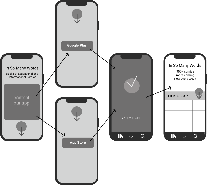
I suggested to create an archive app that users could download from Google Play or the Apple App Store.
Download App Process
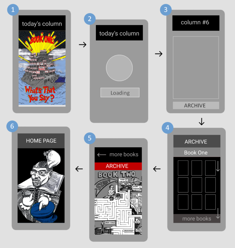
Today's Column Flow
Today's Column was a part of the Ebook Archive App. The column appeared right after a user opened the app. The user could turn off the feature and go directly to the archive.
Example 2: Paroscientific Website
Paroscientific is the world leader in the field of precision pressure measurements. The corporate headquarters and manufacturing facility are located in Redmond WA.
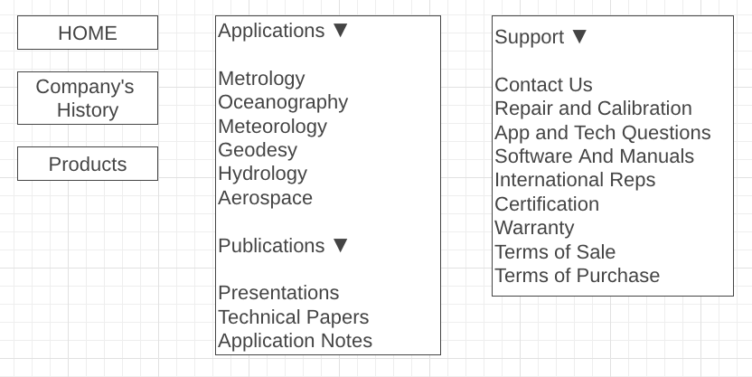
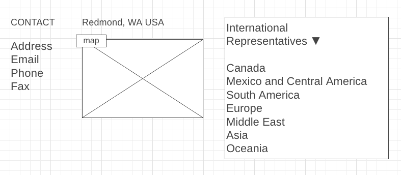
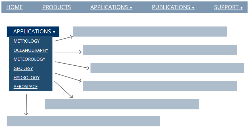
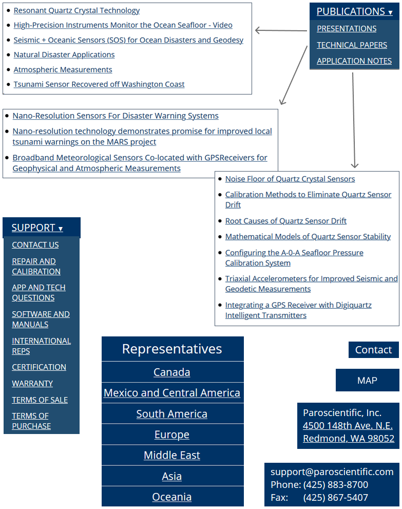
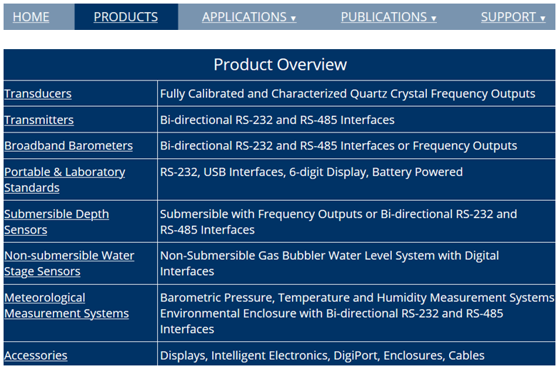
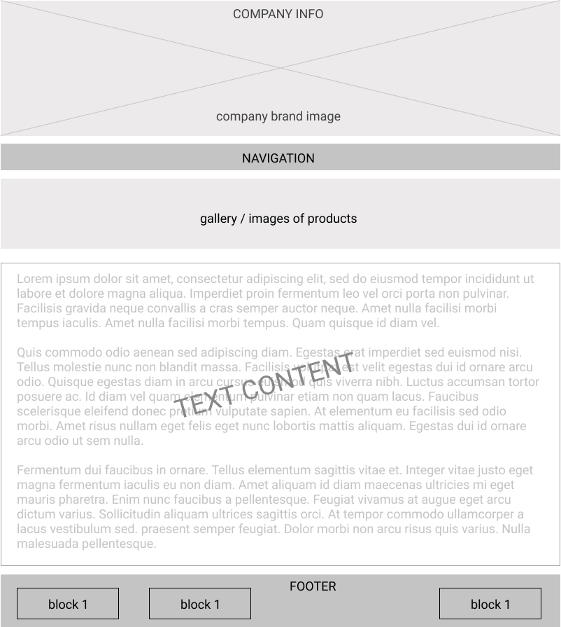
The company hired me to redesign their website and make it mobile-friendly. The company did not want to use WordPress or another platform. They wanted a simple custom-made layout with clean understandable code that could be easily updated directly on their server. The following examples of wireframes illustrate how I designed the website flow and distributed the information on websites.
Site Flow
Contact Map
Applications
Publications & Support
Products Library
Homepage
Prototypes
A prototype is an early version of a product. It demonstrates functionality, but it is much more advanced than a wireframe. Prototypes illustrate the progression from one screen to the next, while wireframes give you an idea of where things go and how the product will work.
I use prototypes to demonstrate how a user might move between tasks or actions to accomplish certain goals. I also identify potential issues users might face during interaction. Below are some examples of prototypes I built for various projects.
Example 1: Dynamic Vision Website
The Neuro-fitness company wanted to add a new product to sell. They chose the strobe sport dynamic glasses. The product was made in Japan and not well known in the US market.
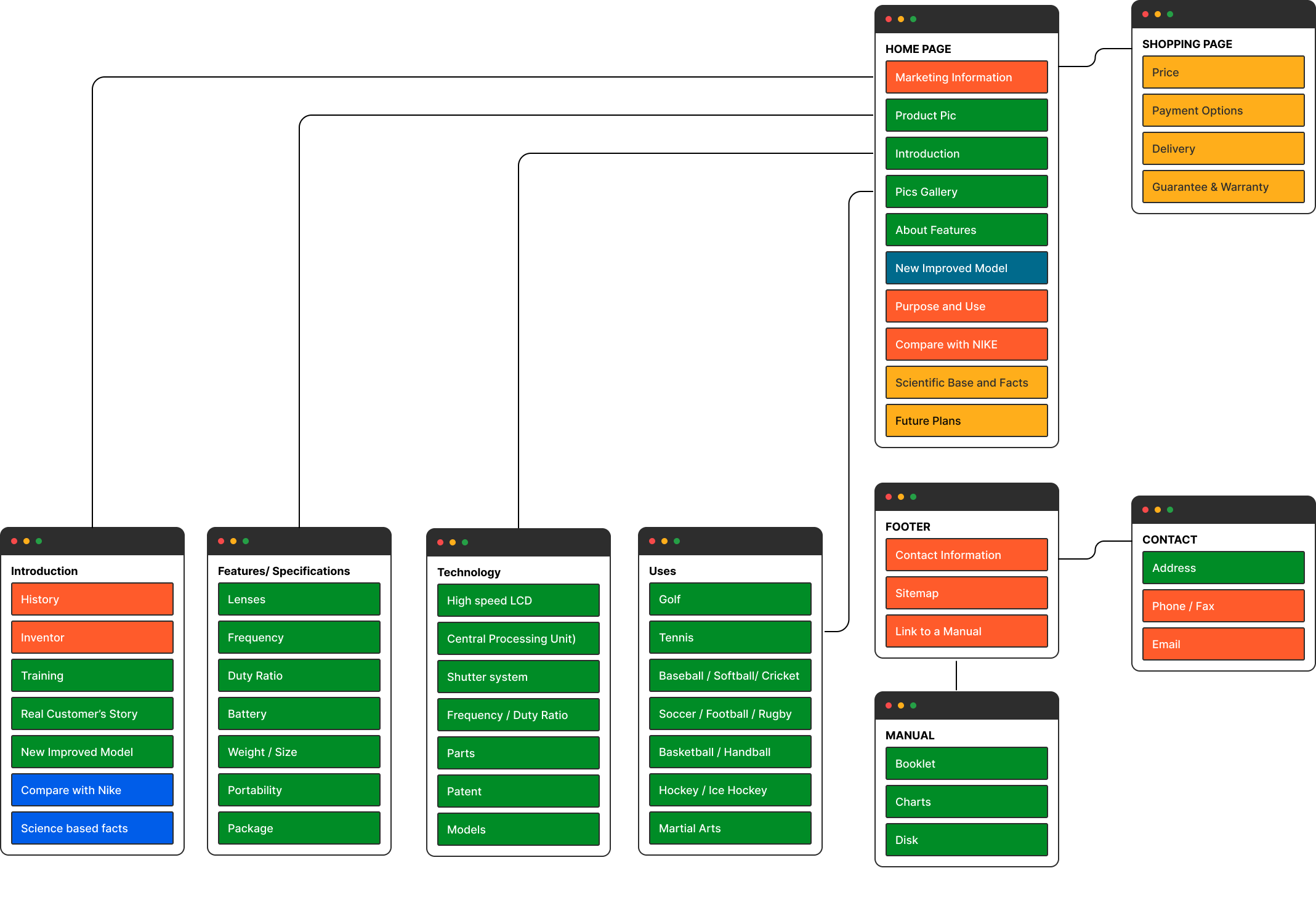
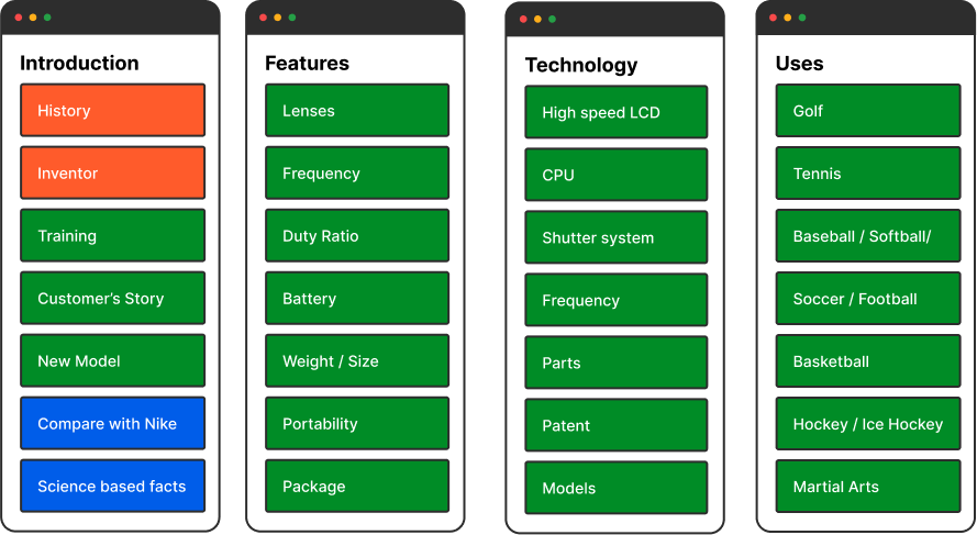
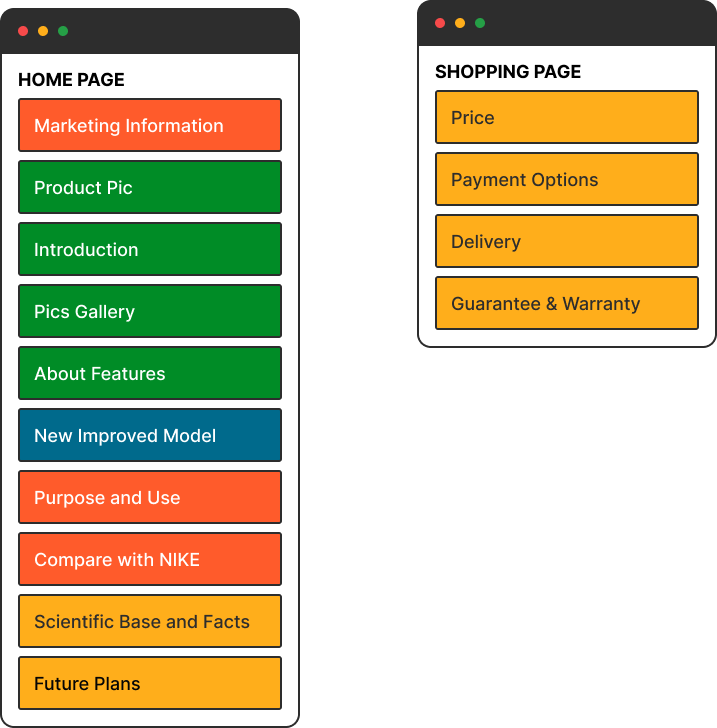
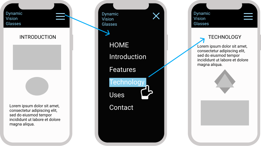
I led the process of moving their new product online. The first step was to build a website. To encourage users to purchase, the website would provide a lot of information about the product. I was responsible for building navigation, information architecture, wireframes, prototypes, mockups and templates for their website.
Website Structure
Small Screen Navigation
We sold out of the product fast and could not secure more shipments. Then we closed out the site and delete the product's web presences.
Example 2: Comics Books
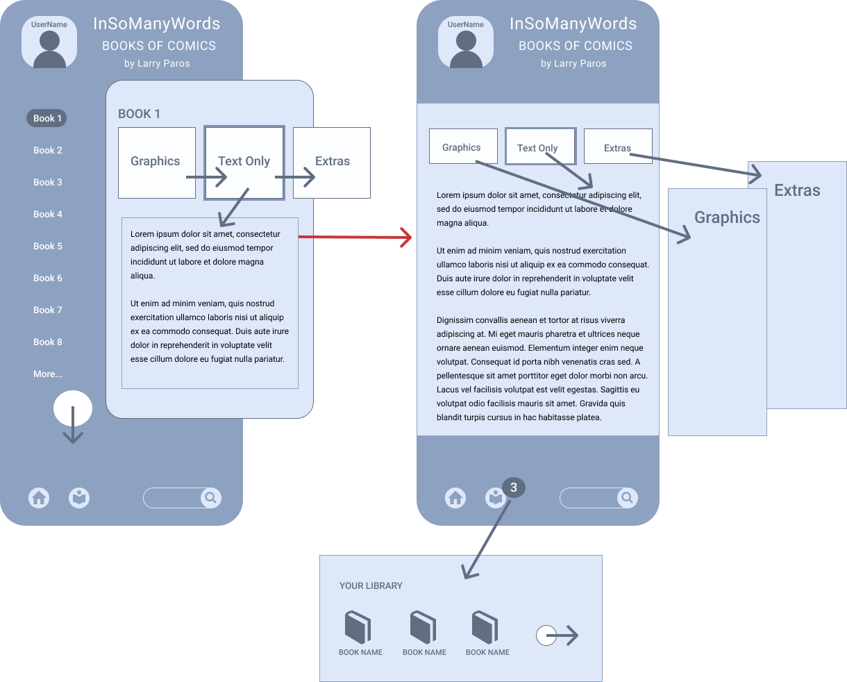
The Books Samples project was a part of a bigger project — promoting Educational and Informational Comics online.
I led and coordinated the development of the comics website and samples library app. I also established social presentations for the comics including author and books portals.
Books Samples/ mobile
Books Samples/ iPad
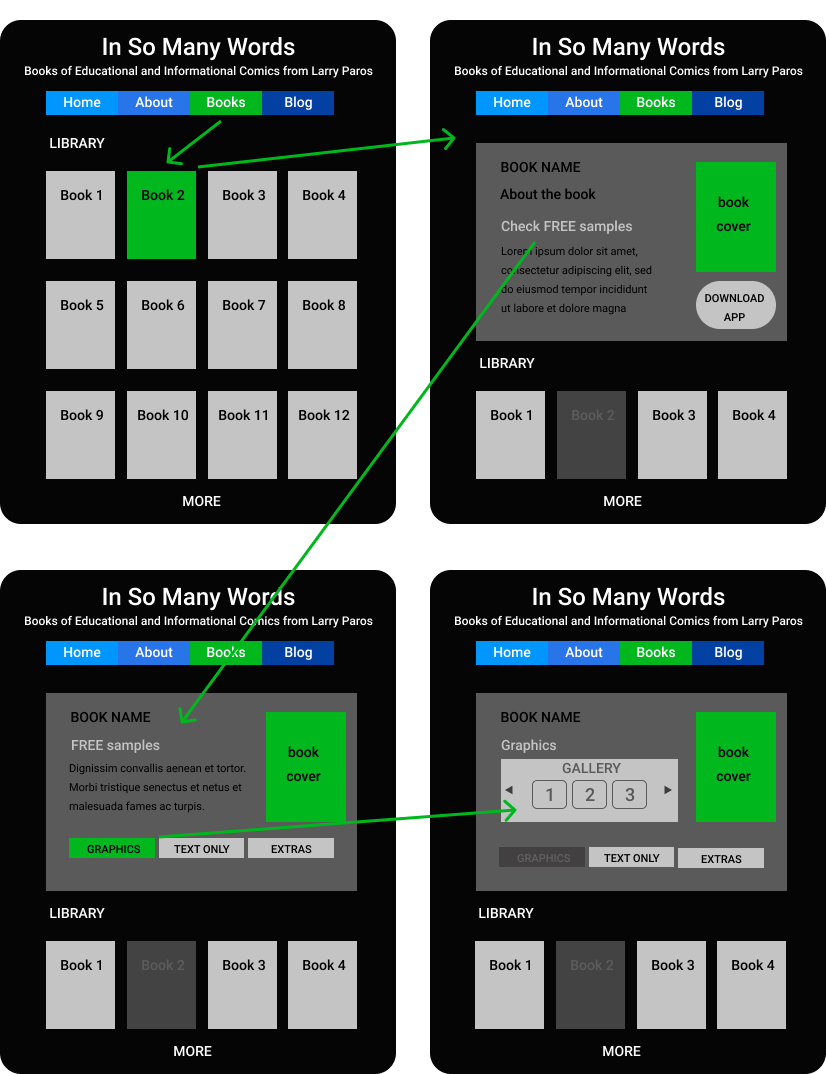
I used Figma to create the Archive's prototypes and flow. Figma's Prototype mode includes actions such as Navigate to, Scroll to, Open-Close overlays, Swap, and Open a link. In Figma's presentation mode, actions can be shown frame-by-frame.
Example 3: Animated Prototypes
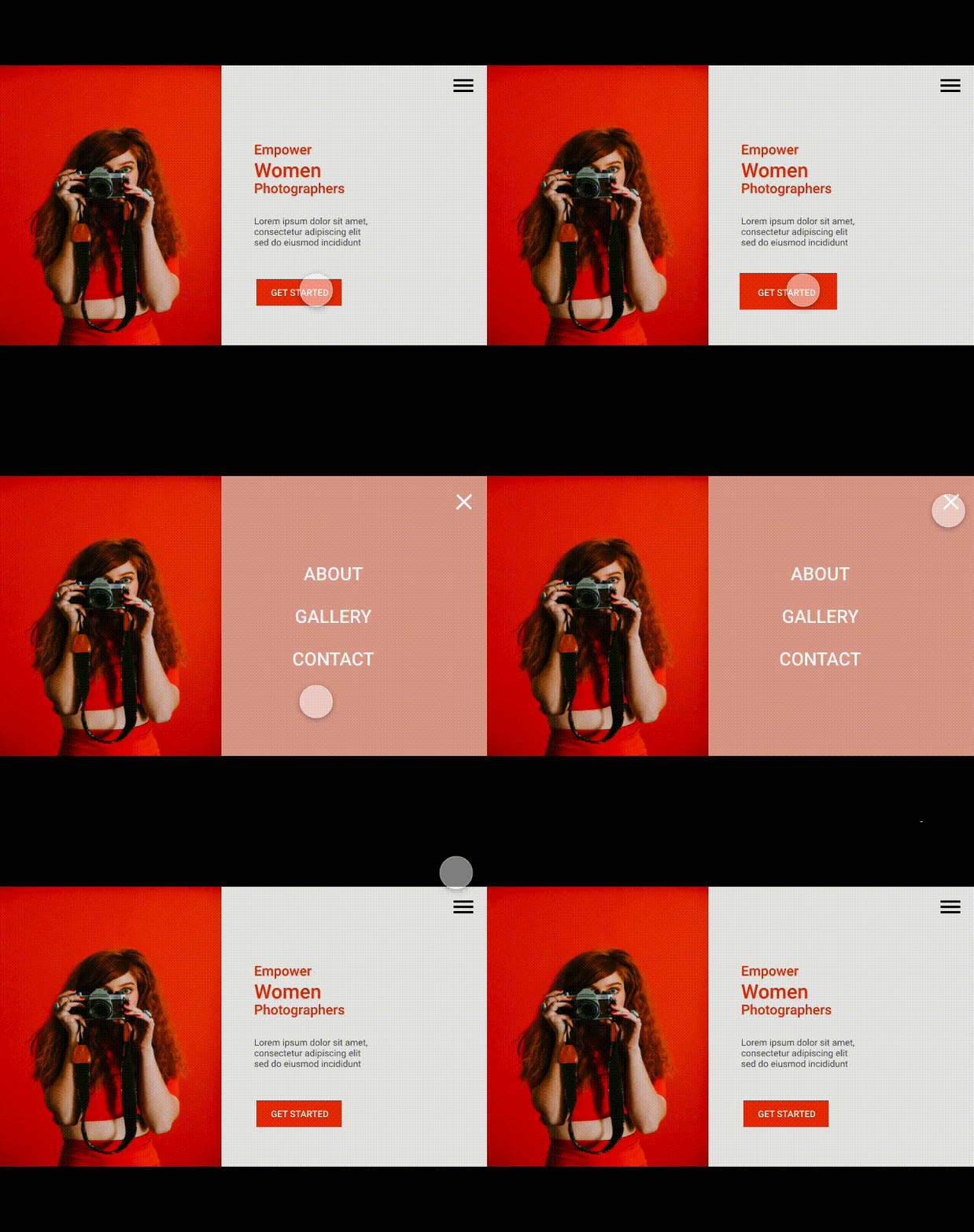
By Adobe XD
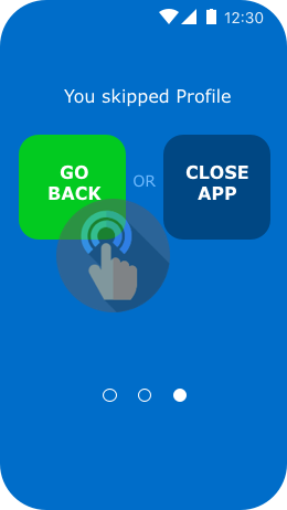
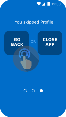
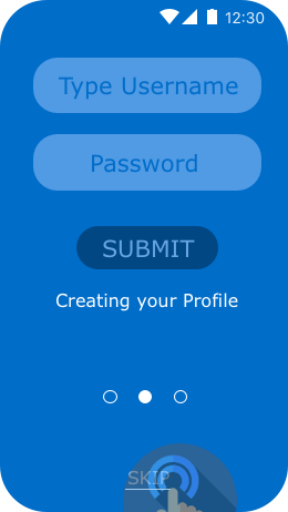
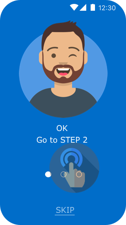
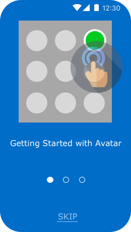
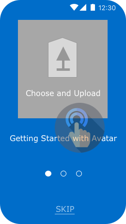
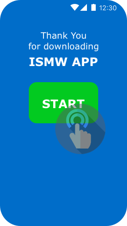
Adobe XD share button has even more options. Not only can I share my design and projects online I can also get feedback from other team members. Adobe XD introduced a recording feature in its prototyping mode. This feature allows the recording of an interactive prototype and display as an mp4 video. After saving the video I can use it as is or convert it into a gif animation.
By Sketch
I like the ability of Sketch to turn static artboards into interactive prototypes with animated interaction. The prototypes can be previewed in Sketch and shared on Sketch Cloud. I am in control of who can see my work -- I can invite people via email, or share a link with the team or make the document public.
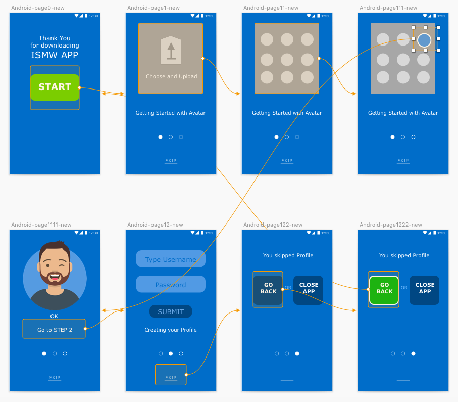
Sketch does not have video recording or animation exporting features but there are sketch plugins and tools that can help create videos and gif to show and play prototypes. I used Anima plugin, it has some bugs and inconsistencies. I prefer to code my sketch animated prototypes.
Mockups
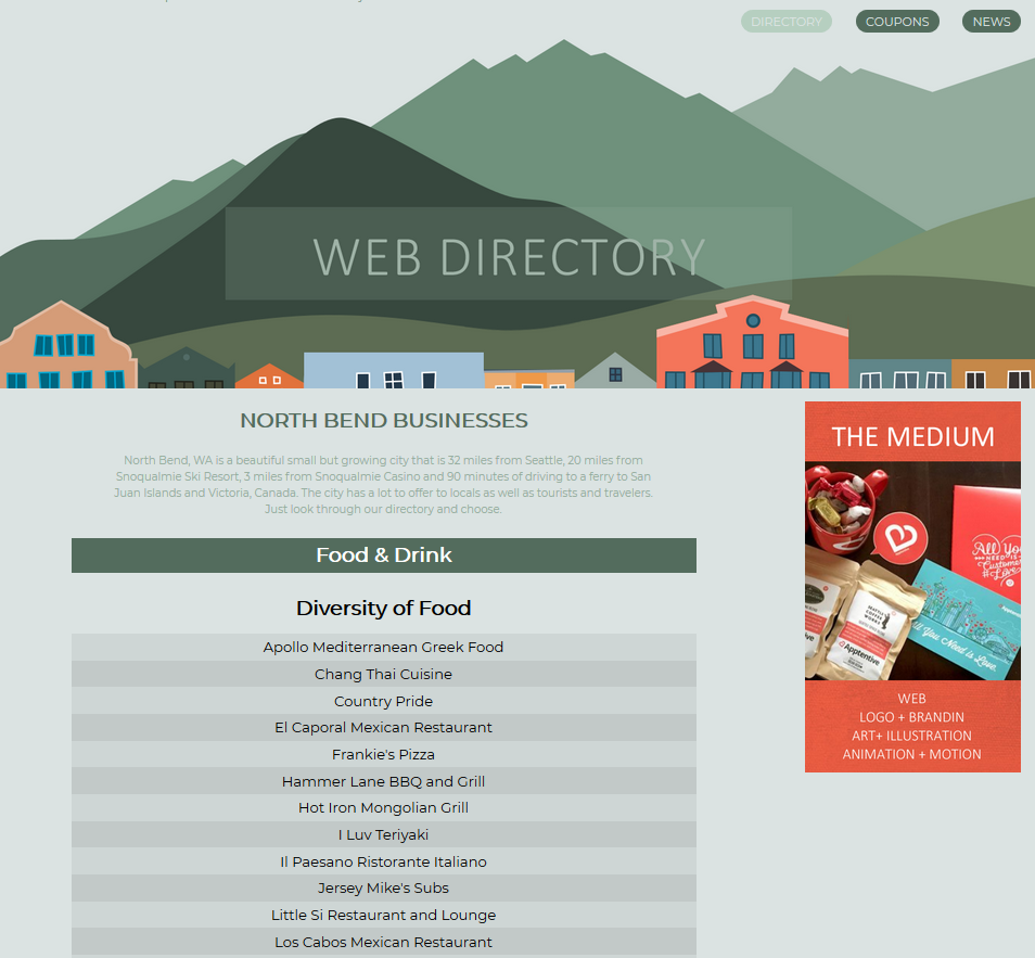
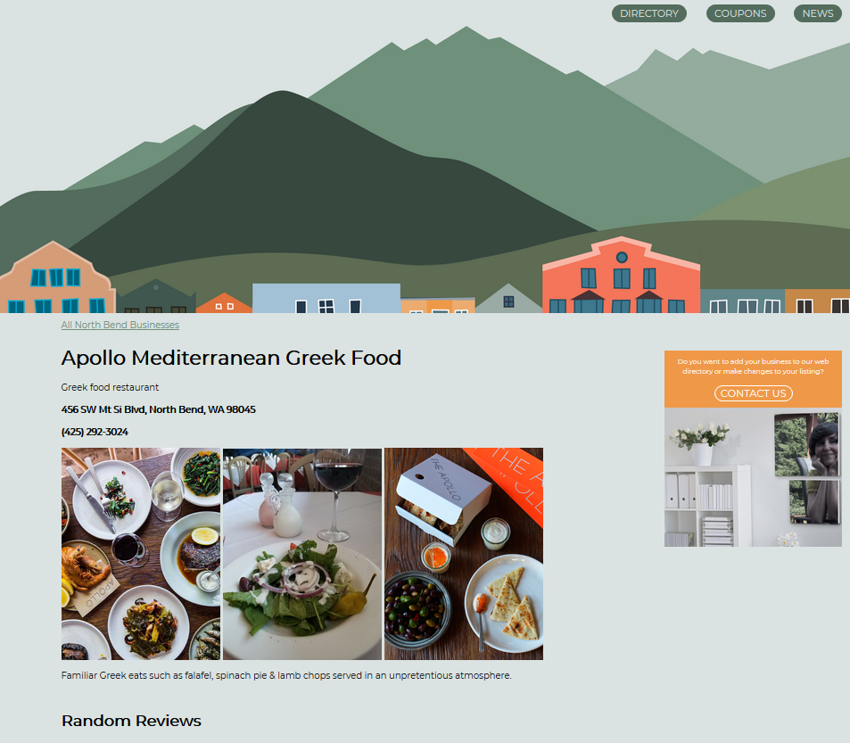
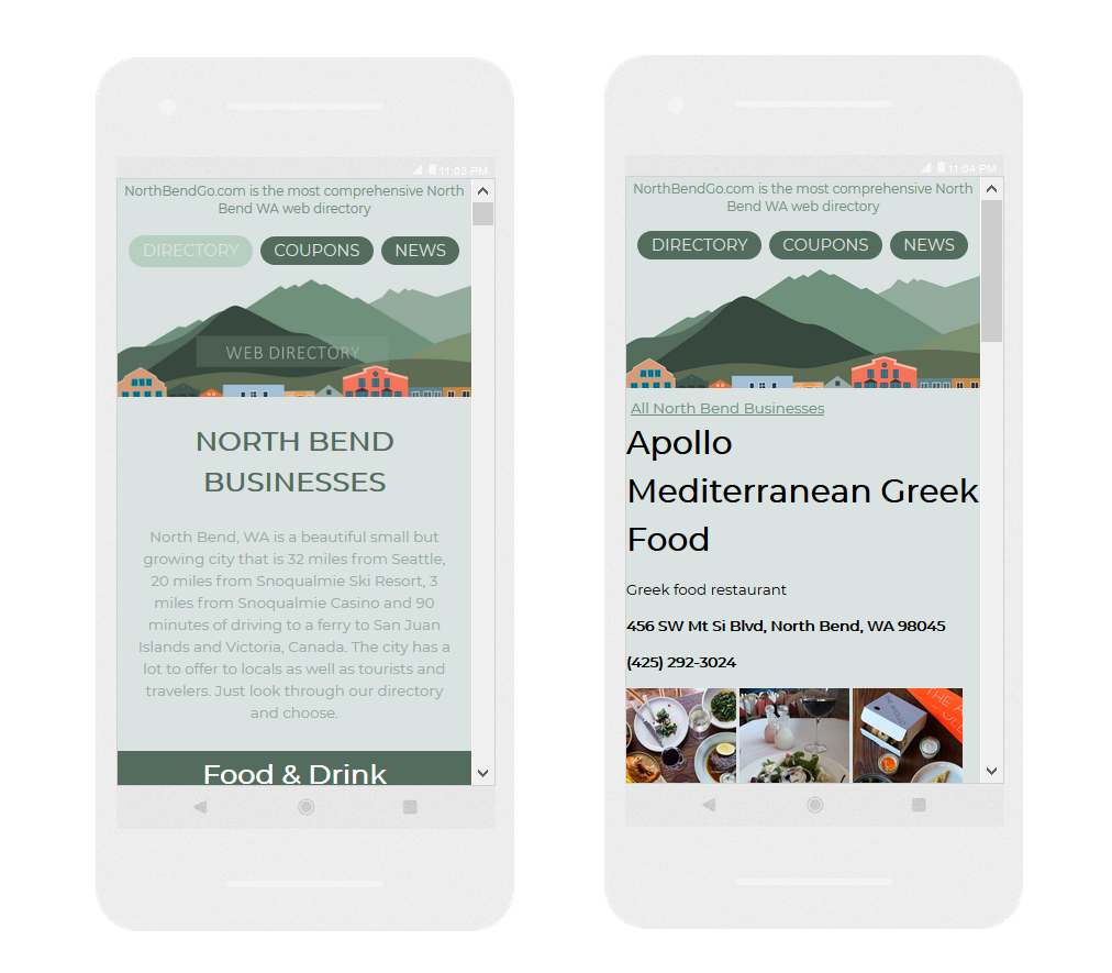
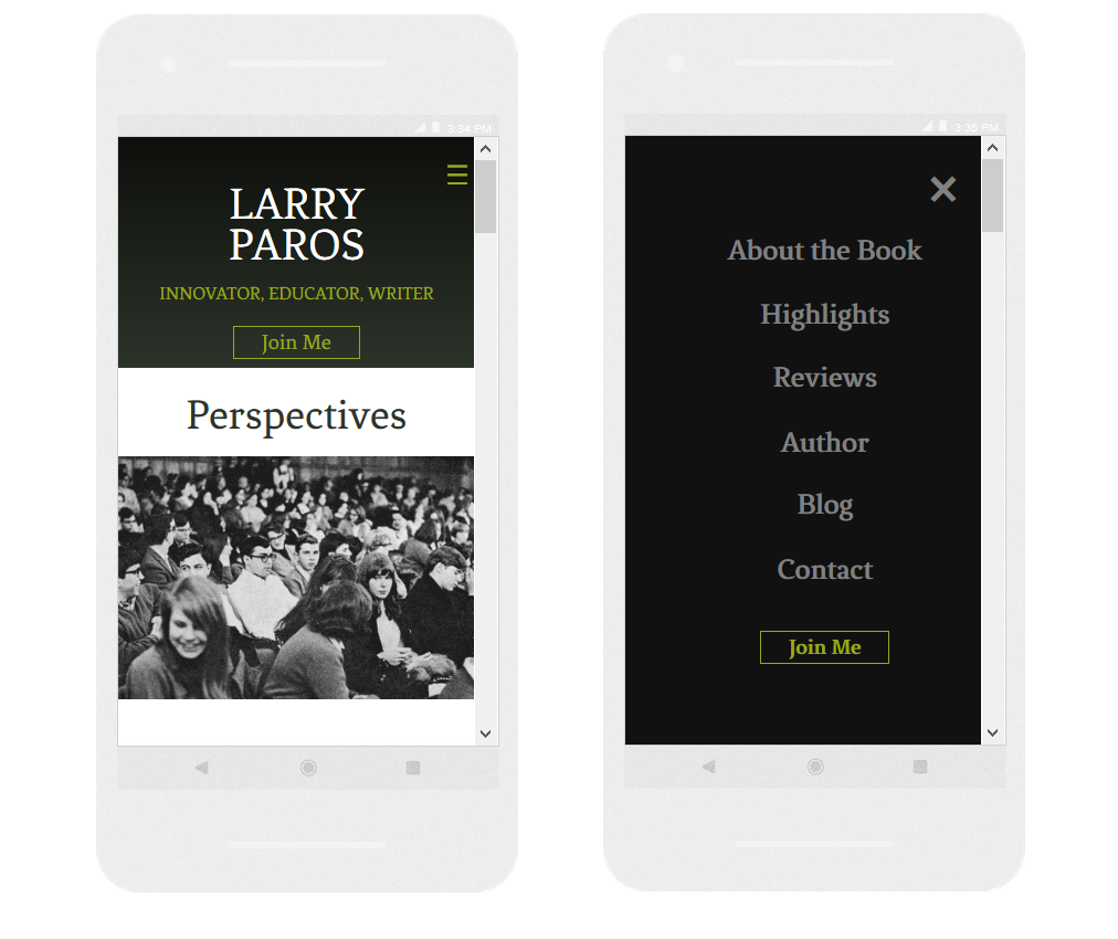
A mockup is a high-fidelity representation of a finished product. Mockups highlight user interface look, feel and function. I make mockups to show the finished product in action. Visual part of mockups may include typography, iconography, color, and overall style. I also add blocks of functionalities. Mockups demonstrate how the brand identity will be interpreted by the audience and how users will interact with the product. Below are some examples of mockups I created for two different digital products: web directory and author book portal.
Example 1: Web Directory
Desktop
Mobile
Example 2: Author Book Portal
Header (mobile)
Header (desktop)
Footer (desktop)
Footer (mobile)

Validation /Testing
A UX design process places the user's needs at the center of the process. User Experience design is all about testing, testing, and more user testing.
Validation (or Testing) is an iterative process that may involves multiple steps.
I strongly believe that it is important to validate not only at the end of the UX design process, but throughout the process of reaching our goals. I always encourage team members to share their opinions and provide feedback to wireframes and prototypes while I am working on them. I can improve these interim outcomes based on team suggestions. I've found that the best way to work on interim outcomes is as a collaborative effort in which everyone in the team is encouraged to participate in testing. These interim validations are essential to the design process. It helps all team members including marketers and developers understand if the final results will work well for users.
Validating the final high-fidelity designs with end users is the next step after interim testing. End-users may include current and potential customers or other target groups, as well as employees, contractors, and stakeholders. New technologies bring new types of users - virtual personas created by artificial intelligence software.
In a perfect scenario, millions of AI-created personas and thousands of real humans are already signed up for testing and waiting eagerly to get started and fill our database with their information and feedback. I haven't seen such a "dream" situation yet. In real life, validation relies on much less data, from fewer people, and does not involve AI-personas. I have worked at best with data from a few hundred users and in most situations, I have worked with even fewer. The lack of quantity of information can be compensated with quality. It worked well for projects I was involved in.
I used a variety of testing methods in my work, including:
- Online and offline surveys,
- Forms and questionnaires on our websites,
- Data from subscription services like usertesting.com,
- Usability tools, accessibility checkers, beta testing tools, A/B testing,
- Search engine (google and bing) web master tools,
- Analytics (search engines, social media, platforms, blogs)
I am a practical UX Designer dreamer who is always eager to try new approaches but at the same time I focus on testing tools and approaches we already have or that are within the scope of our available time and resources.