Visual Design
Simplicity
Simplicity is my favorite design principle
I like the KISS idea — "Keep It Simple, Stupid." The phrase is thought to have been born at the Lockheed Skunk Works by engineers working to develop the Blackbird spy plane. This acronym became the first unofficial usability principle for product design.
The layout of modern websites and apps is based on the KISS principle of simplifying and decluttering. It became the cornerstone of a good user interface. The simpler and cleaner the interface, the easier it will be for users to understand and navigate.
How I "Keep It Simple"
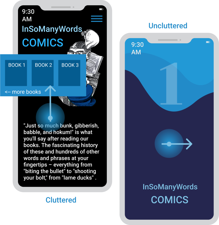
Decluttered Mobile User Interface
You can see the difference. While more clattered interface is OK for bigger screens, it became difficult to read and understand on a smaller screens. In this example I use a big button that allows users to easily slide to text.
Parallax for Consolidating Content
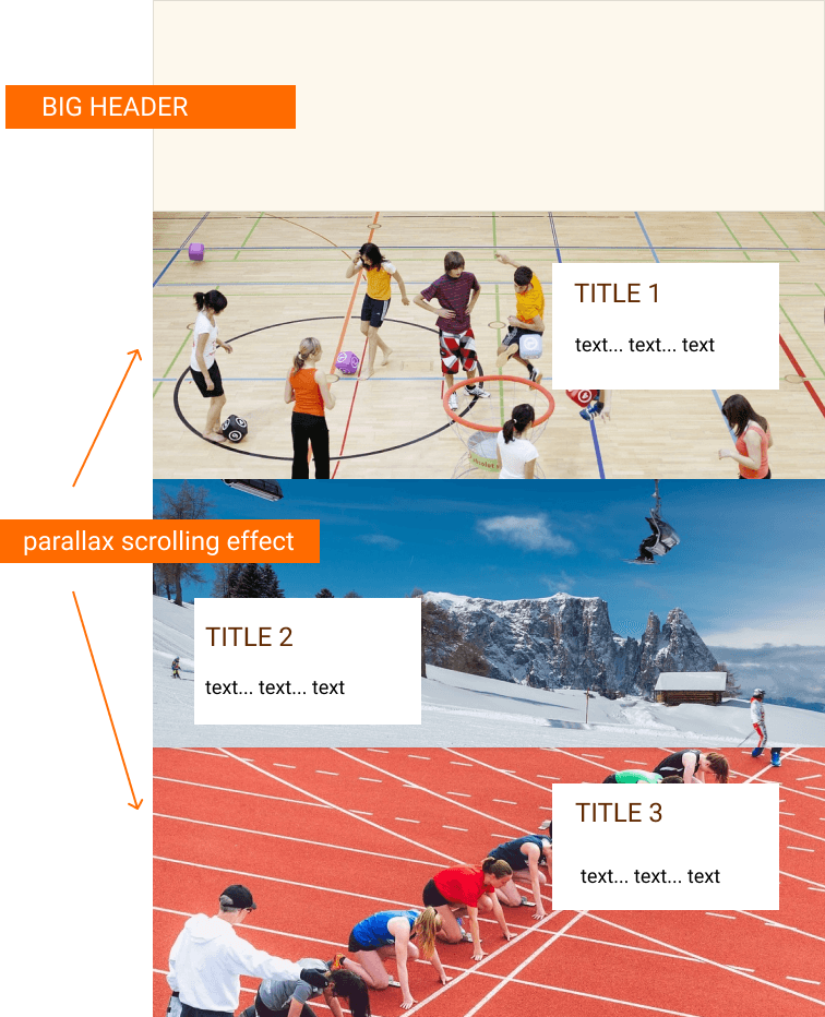
Task: Create a website that can show many images and text yet not to be cluttered. This site is to encourage middle-school students to spend more time outside in nature.
Decision: I built a few interactive mockups. They were tested by a group of students and teachers. More than 60% teachers and 80% students preferred a parallax scrolling effect. The parallax website has one page that includes 12 preloaded divisions that move slightly as a user scrolls down. Each division has a block of text on background-images, and that's all. This minimalistic approach makes it easier for users to read and grasp the content. As a designer it is important to understand how much information a user can comprehend in a given space.
Stackable Boxes Layout
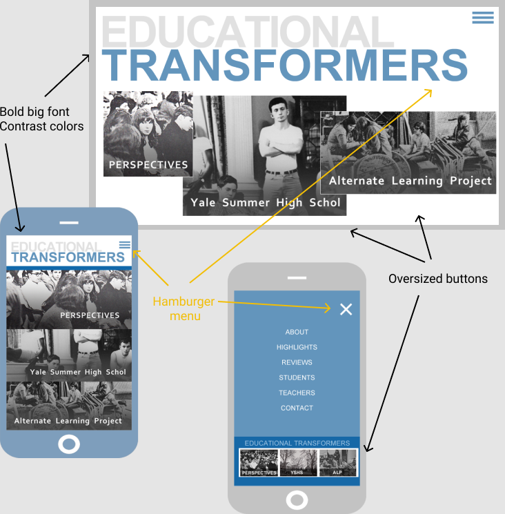
Task: Build a web app to show three different stories under one topic.
Decision: I made the title of the main topic the centerpiece of the page's header. I used a big bold font and two contrasting colors to make the title very visible and distinguishable. I designed interactive boxes with links to stories. Each story has its own box with a title and photo. I increased the sizes of the boxes and placed them just under the topic's title. This approach to design makes the user interface clean and easy to navigate on desktops, Ipads as well as mobile devices.
Vivid Image Centerpiece
Task: Create a home webpages layout around a very vivid red image.
Decision: After playing with different images and layouts, I decided to use only one image with a red-orange background. I made it the primary color and used different shades of dark gray as contrasting colors.
Fat Header
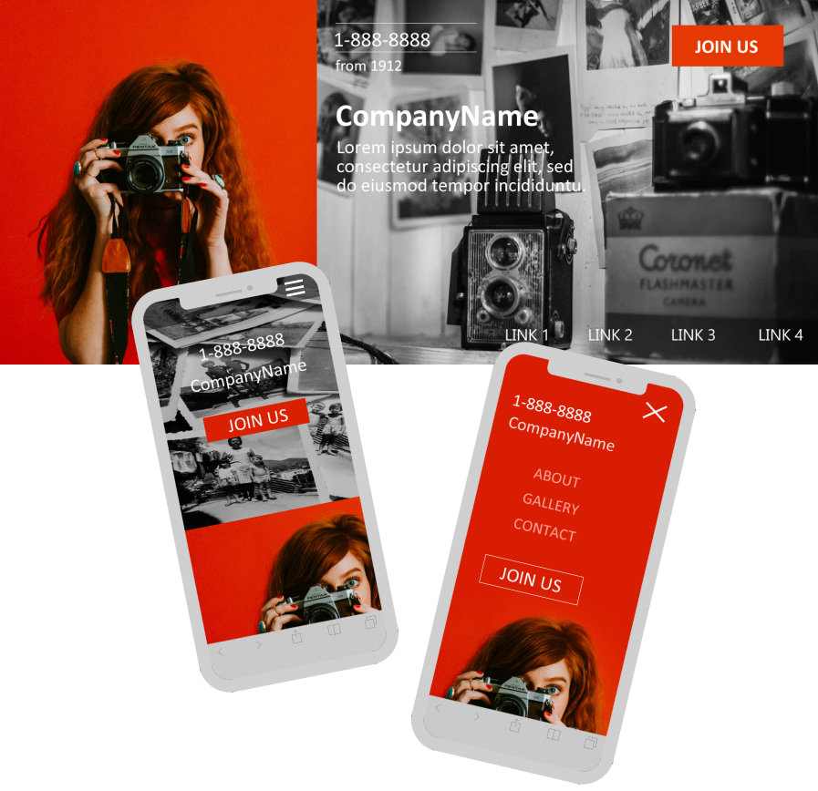
Task: Delete unnecessary text and images from a web app content.
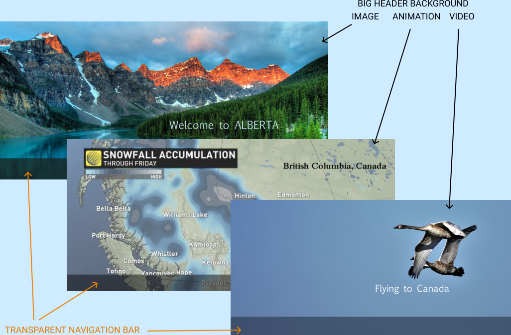
Decision: I suggested to use a "fat" header with text and navigation that are placed on an informative image- or video-background. This approach immediately signals users as to what the website is about and how to navigate it.
Downsize to One
Task: Declutter an interface for ISMW Crosswords App.
Decision: I suggested completely changing the initial approach of showing all crossword games. Instead of icons of all the crosswords, I recommended to deliver only one random crossword at a time. If a user liked the crossword he or she could go on to solve it. If the user was not satisfied with the crossword they could try another random crossword or go directly to our crosswords library where all crossword's icons are displayed.
From my mobile app mockups you can see that I prefer to move the main navigation to the bottom and use icons instead of links. Positioning the navigation bar at the bottom makes it easier for users to navigate apps.
AIrtificail Intelligence for Design
How I use AI-generated faces
AI-generated faces first appeared a few years ago, and they have spread rapidly since then. You probably saw them online even if you weren't aware that they were AI-created. Faces generated by artificial intelligence software can be found on customer support chat lines, online friends, meetup groups or even dating sites. Below are some examples of my work where I used AI-generated faces.
Chat App Mockups
The faces look very real but they are not. They are AI-generated images. These people do not exist.
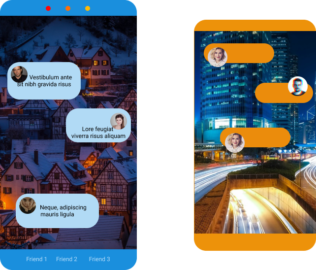
While placing AI-faces on real websites and apps to disguise them as real is questionable and in many cases not ethical, using them for prototypes and mockups is perfectly fine. I use them to speed up the process of creating and testing mockups, prototypes and templates.
Customer Support
All the faces you see in the "Customer Support" layout block were generated by using Artificial Intelligence. The software was not perfect. It produced images with unwanted parts in them. Some created faces were blurry and some didn't look natural, but I was able to select good quality realistic-looking faces.

Can you find my face?
I participated in an API testing project where we added some real faces to a bulk of already produced images to mix our face features with theirs. Below is a random set of a few from thousands of project's images.
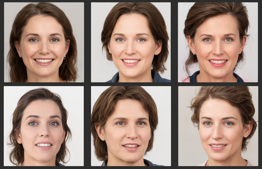
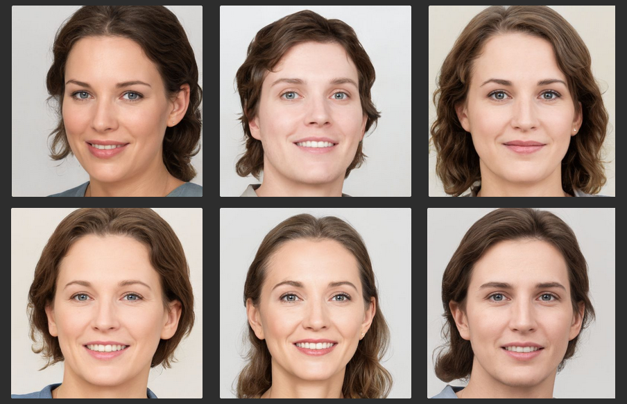

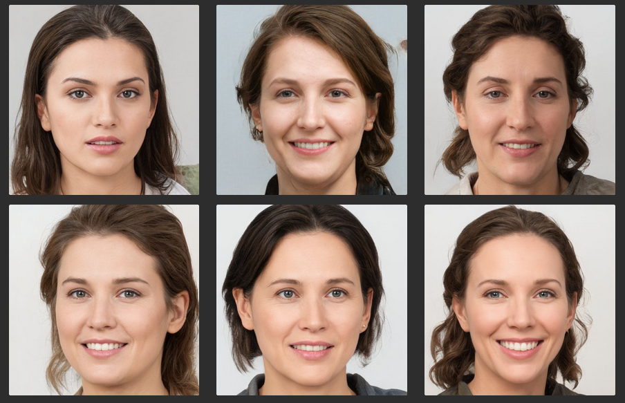
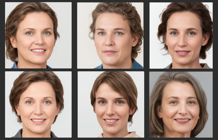
All these faces are generated by AI-powered software. Three of them may have some of my features. To see pictures of the real me please check out my "Moodboard".
Why I use AI-generated faces
AI-faces can be useful for filling out prototypes, jazzing up promotional materials, or illustrating concepts too touchy for a human model such as "embarrassing situations". AI-generated faces:
- look great and very realistic,
- give designers endless faces to choose from, and
- eliminate legal and usage issues of using real people images
User Interface Components
Customer Review Block
Dr. Kate Gronken never existed, never worked for the Lakecity blood center. I chose her face from dozens of others generated by AI-software. I used this fake face for fast-prototyping. When we were ready to move on to the final layout for our websites and e-newsletters, we changed AI-faces to real people with their permission.

Team Members Stripe
A very common use of AI-generated images is for prototypes and mockups with reviews and team members sections. See what I created for a classical "Our Team" section.

Banner Box
This little girl also does not exist. Her cute face was AI-created. I used the image for banners in e-newsletters and online articles.

Kid Faces Elements
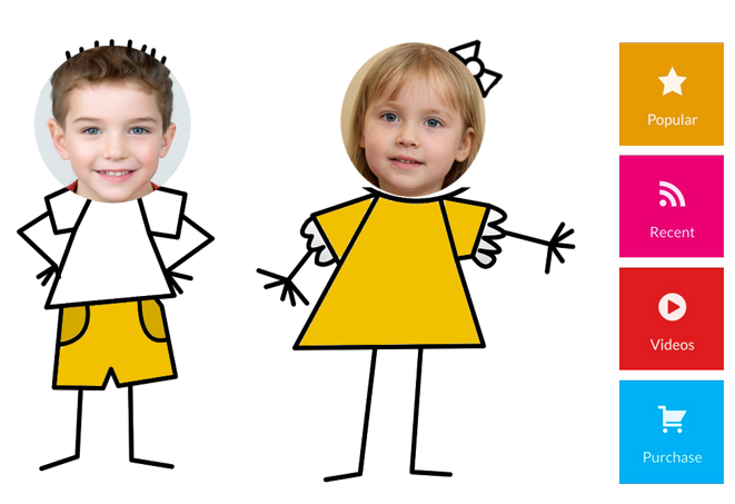
I love these little ones. They helped me to build a lot of great UI components for kid-related web apps and shopping carts. I do not need to ask permission from their parents. The mother of these cute toddlers is also from Artificial Intelligence software.
Sensitive Material
All these people never existed in the real world. They do exist in my design projects. I use them for a sensitive matter such as fighting drug addictions, crime etc... AI-generated people don't mind their faces appearing online or in marketing material./p>

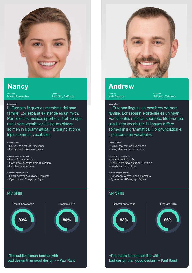
Building a Persona
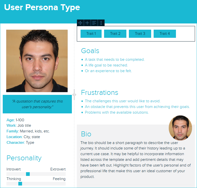
AI-generated images of people are great for creating UX personas. Below is an example of how I used such images for persona segments.
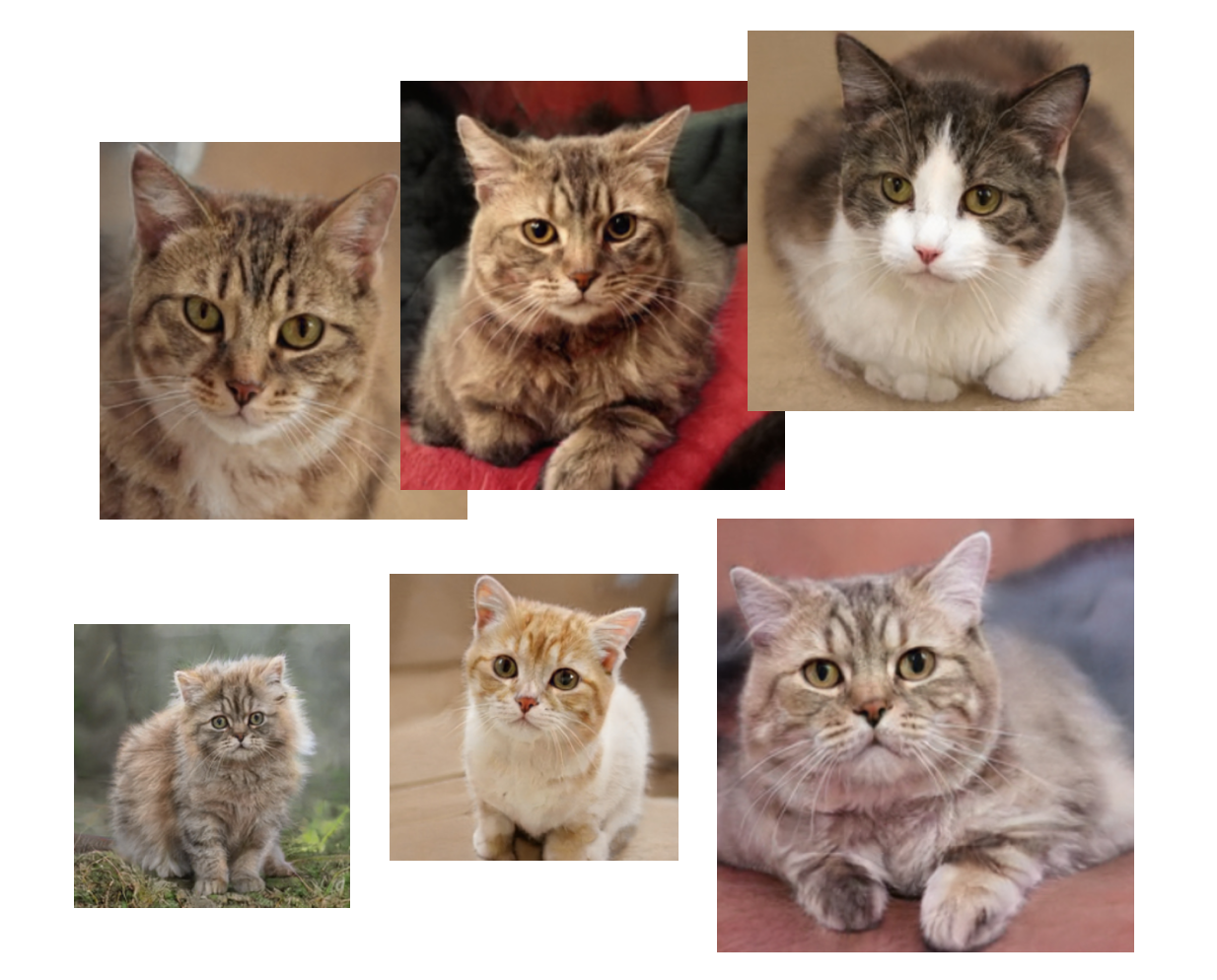
AI-generated cats
Being a part of the World Wide Web I cannot resist the temptation to use some of the most popular web images — cute cats. I found AI software that could generate images of animals. These are not perfect as AI software is still evolving. After many attempts I was able to create some good images of cats. See examples below. They are so cute. They can be used for presentations or just for fun.
Modern machine-learning techniques can generate very detailed and colored images that resemble people so precise that it becomes nearly impossible to recognize real faces from "fake" images. AI technology is becoming so sophisticated that it is now able to create not only faces but full images of everything including people as well as audio and video files. It brings to us a dark world of fakes and deep fakes that we can expect to see more in the future.
I always follow an ethical approach in working with AI-images.
Colors
How I use colors in my design
Colors help me draw attention, organize content, emphasize elements, evoke emotion and make a design more visually appealing. Knowledge of color theory, understanding the color wheel and relationship between colors enhance my creativity.
Futuristic Neon Colors
Bright neon colors is a new trend in a mobile app design. They increase recognizability and set mood and atmosphere. Here you can see neon color I used for mockups for a mobile "Self-help Books" app project.
Monochromatic Palette
While trendy neon colors are great for teens and young adults, for the conservative users I prefer to apply a more classic approach to colors. You can see it in a mockup I created for the 's "Crosswords & Coffee" iPad app
Focused Colors with Minimal Color Usage
Monochromatic colors can be boring. A new trend — Focused Colors with Minimal Color Usage — is mixing semi-monochromatic use of two clear-distinguished color palettes. I used this approach for the NorthBendGo project.
Complimentary Colors Palette
I apply complimentary colors for Call-to-Action pages. Complementary schemes are based on two colors from opposite sides of the color wheel. Because the two hues will be greatly different, such schemes can be very noticeable and have a big impact. Below is an example of a component I created for an e-commerce prototype.
A Triadic Color Combination
Triadic colors are great for highlighting a small element of a design. Here you can see how I use a red-blue-green triadic combination to make it easier for users to locate a price.
Bright Color Patterns
Sometimes it's OK moving from standard color palettes and mixing different bright colors. Below are examples of my experimenting with color to find a right mix.
For this beach game app I used blue as a dominant color, silver-white as supportive and scattered a lot of bright colors on a starter slide.
For this navigation block I use two very distinguished color palettes — cold and warm. It looks good on tablets and online presentations.
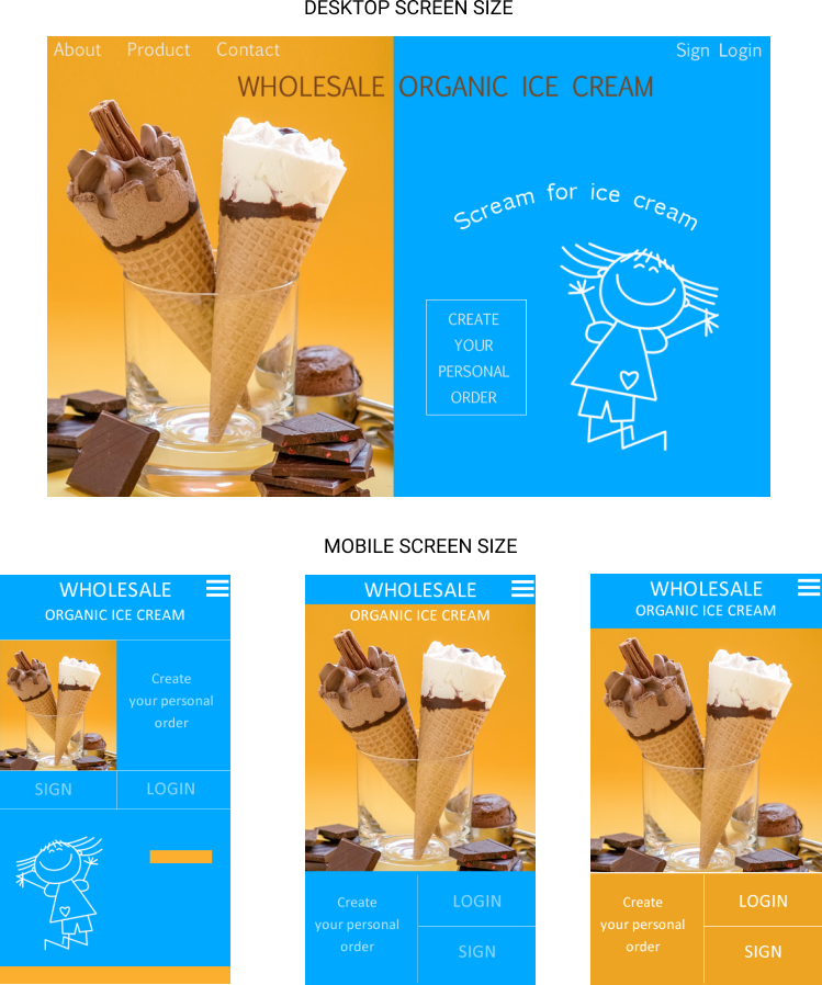
For the Organic Ice Cream mockups I use contrasting colors. Color contrast helps the user distinguish different areas of information and encourages user interactions such as "Login" and "Create Your Personal Order".
Analogous Colors
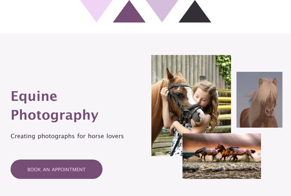
I use analogous colors to create a unified feel that is cohesive but without the monotony of a monochrome scheme.
Shades and Tints
I use shades and tints to make my design both polished and elegant. Such design is pleasing to the eye and brings a feeling of uniformity. Tints and shades are the lighter and darker variations of a single color. Tint is a mixture of a color with white, which reduces darkness, while a shade is a mixture with black, which increases darkness.
How I use colors for wireframes
For wireframing I utilize mostly shades of blue or gray. It makes it easier to present ideas of a website and show the distribution of information.
Example of wireframe's colors:
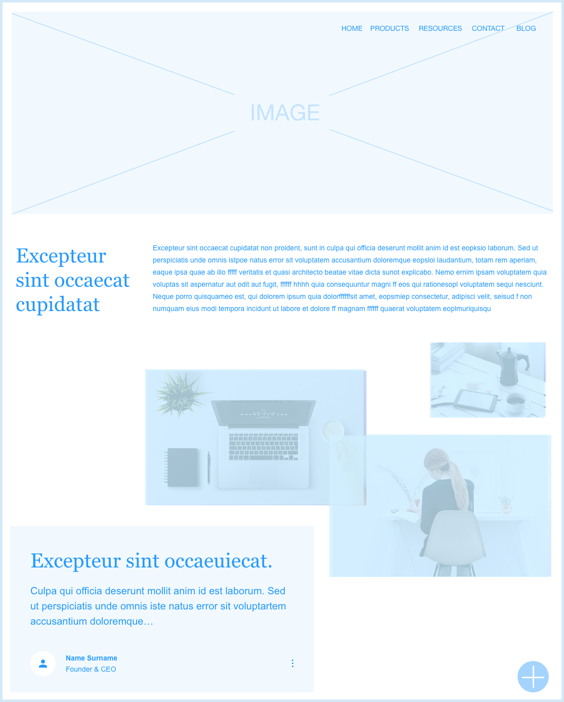
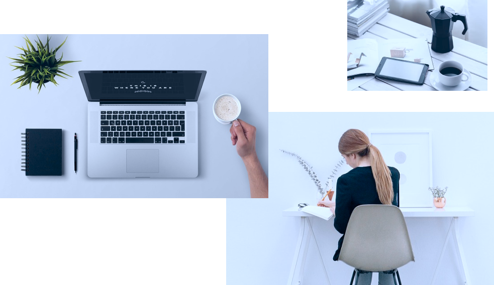
Monochromatic colors can become monotonous. To avoid monotony I often keep other colors below a transparent monochromatic color. See an example below.
How I Pick and Choose Colors
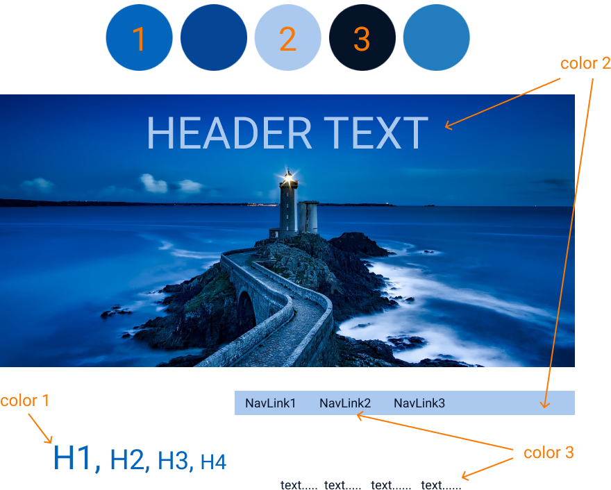
I use color extraction tools to find main colors and their hex code. It's better not to use more than 3 colors for a website template. In a perfect world I prefer to follow the 60-30-10 rule that states three colors should be used in varying degrees (60%, 30%, and10%). The primary color should cover about 60% of the space, the 30% should contrast with the 60% and the 10% is a "complimentary color" to accent the primary or the secondary color.
Main colors
This example shows how I extract main colors from photos. I can use the main color for the header1 and pair it with a silver color for the header2.
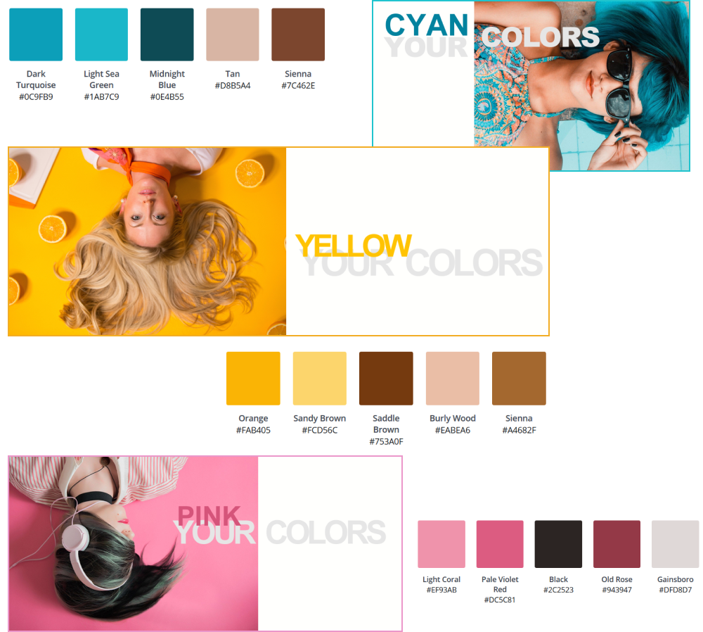
Contrasting colors
This example shows how I play with different extracted colors to choose a pair of contrasting colors. This is very useful when there is a colorful main image on a silver background. A website's color palette can be built around a silver color with a bright secondary color of various shades.
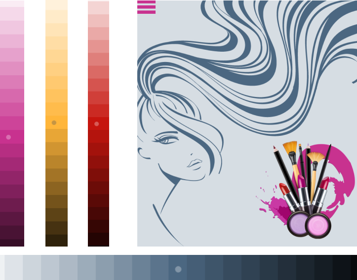
Dominant colors
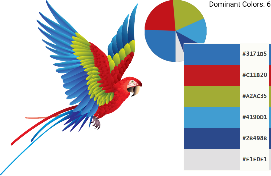
When a website is built around a very colorful dominant image I prefer to identify 4-6 dominant colors for this image. Then I choose 2-3 from these and adjust the colors of other images to match.
Color Guidelines
In a perfect world a visual designer chooses primary, secondary, and accent colors and then carefully applies them to a website's layout without adding unnecessary colors or shades. It's difficult to achieve it in real world. When many people are involved in creating a website color scheme, it becomes easy to drift away from the main palette and add too many shades and colors.
I am confident that any company should have its own design and brand guidelines. While working as a Web or UX designer for companies that did not have such guidelines, I advised them to create one. I did not hesitate to contribute to their guidelines, create digital libraries of different color palettes, and share them with the team.
How I Clean a Color Palette
The example below shows a website with a lot of different shades of its three main color choices — green, blue and gray.

The shades look nearly the same. It's better to delete unnecessary shades. The resulting layout will look cleaner and improve contrast between information blocks.
When I need to clean a color palette of unnecessary colors, I use a tool to extract all colors. Then I choose three shades of the main color. I can apply these color shades for the header text, navigation bar, button's background and content text. For a hover effect I can use a contrasting color for added visual stimulation.
AI-created colors.
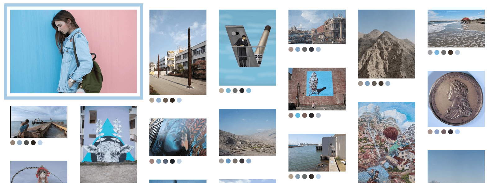
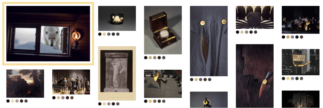
I enjoy experimenting with AI-created images and colors. Below are examples of matching colors I created by using Google's ArtPalette. Its computer vision algorithms are able to match a user's choice in color palette with numerous artworks.
Original Images

Created Images
Light Blue Palette
Dark Palette with a hint of gold color
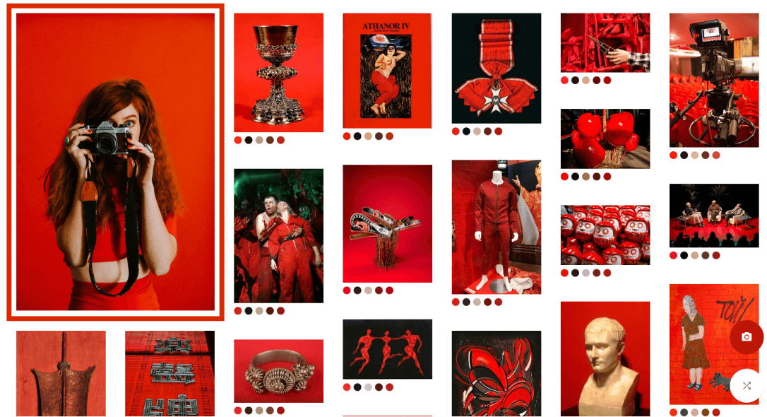
Bright Red Palette
Typography
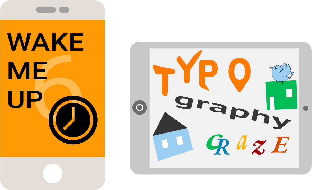
In creating user interface and digital presence, I normally follow the classic rules of typography but occasionally I break from tradition to visually approach a user from a different angle.
My experiments with typography
Why typography is important
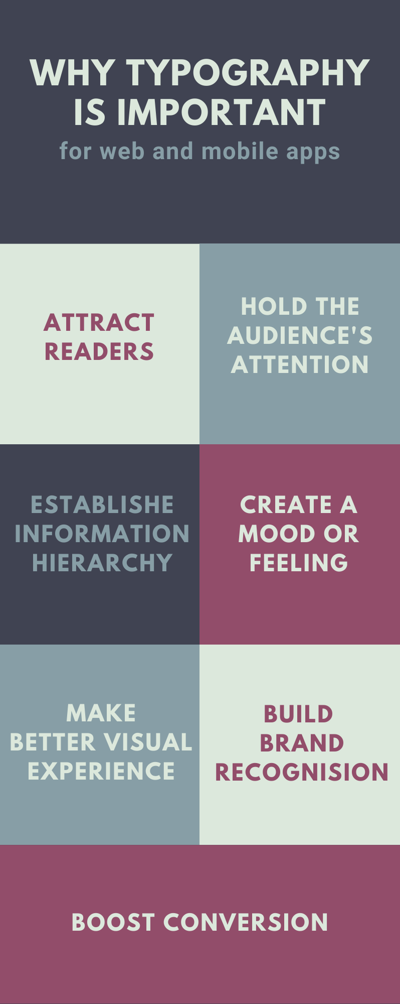
This is one of my infographics I used at meetings or for online presentations to emphasize the importance of typography.
Typography Principles
Typography is based on the classic CCW rules of Contrast, Consistency and White Space, and Typographic Hierarchy
- Consistency rules prompt me to use not more than two font families, one serif (stroke) and one sun serif. In a classical approach it's better to apply serif for headers to bring plenty of attention and sun serif for paragraphs and buttons;
- Contrast rules suggest making a header minimum 1.5 bigger that text size and adding boldness to bring even more contrast;
- Whitespace or empty spaces around elements provide a better organization of typography layout and improve readability.
- Typographic Hierarchy organizes text according to importance within the content.
How I apply typography principles to my work.
Consistency and contrast examples
For mockups
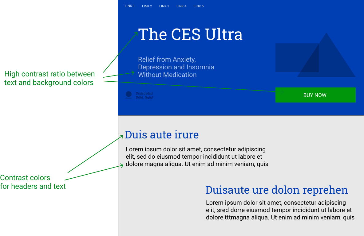
For Web Apps
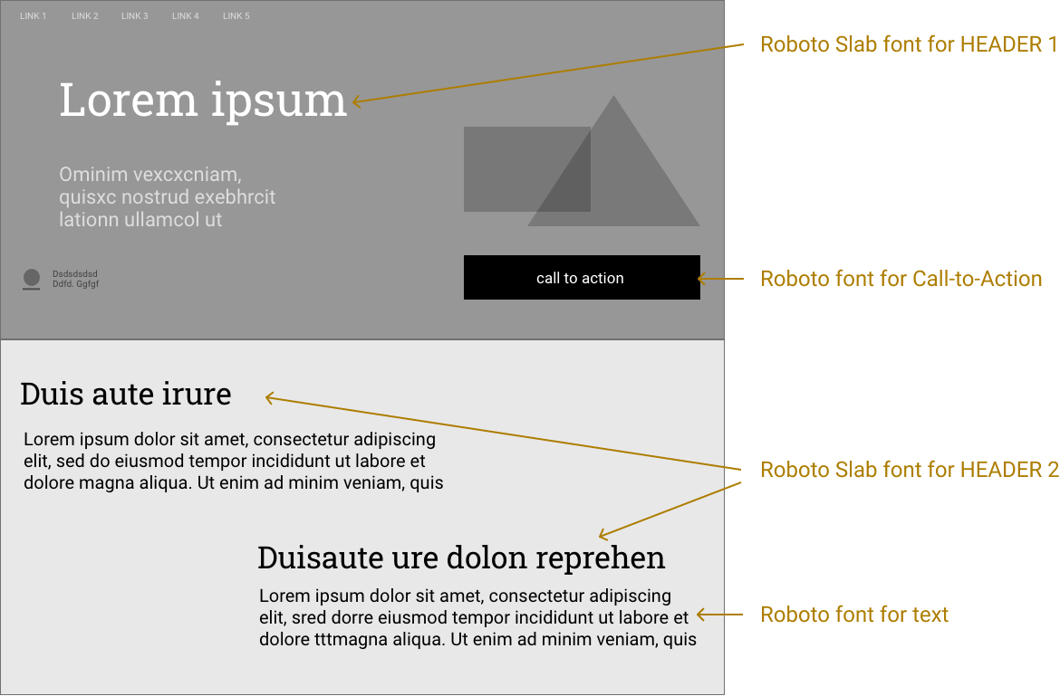
In the process of moving from mockups to online templates our team decided to use only one font and keep contrast colors for backgrounds and buttons.
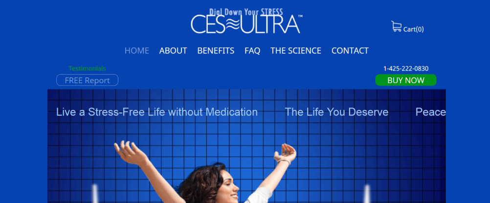
Texture for contrast examples
I often use the "Texture Contrast" effect as an attention grabber for my online presentations and marketing materials.
To make the effect even more noticeable, I add texture to a massive bold font.

Here, I apply a textured background with a face photo to make the letter W stand out and attracts the users' attention.
White space examples
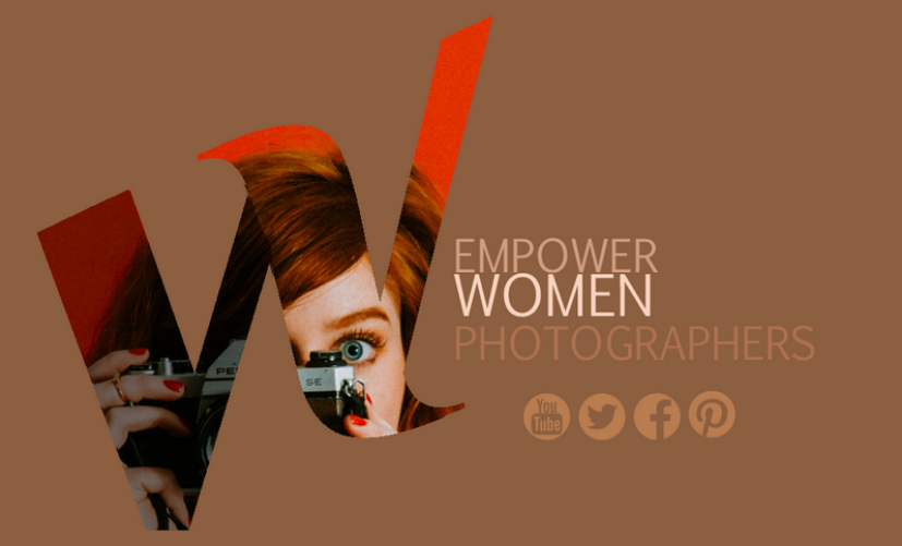
I use empty spaces between and around elements to make it easier for users to read the content. Empty spaces in UI and design are called whitespace or negative space. Whitespaces visually emphasize an element's meaning and functionality. By using whitespaces, I can distribute and display shapes and sizes more effectively, and produce a cleaner layout.
Below examples show how adding whitespace improves usability and readiness.
Mockup WITHOUT whitespace
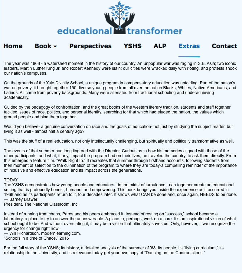
Mockup WITH whitespace
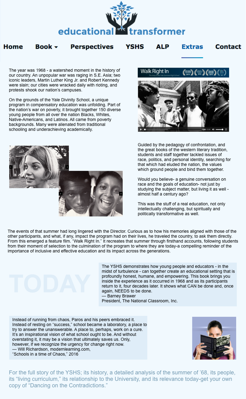
Whitespace does not need to be white
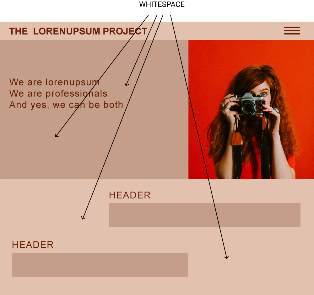
Typographic Hierarchy example
With the help of typographic hierarchy, I organize the content in a way that establishes an order of importance within the data. It makes it easier for readers to navigate the content and find what they need.
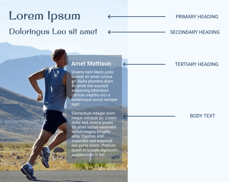
I use typographic hierarchy to create a clear distinction between prominent pieces of copy that should be noticed and read first before the standard text.
Typography for mobile
The same typography principles that apply to websites also apply to mobile apps, but there are some differences. Development of mobile apps is closely related to the mobile operating systems. Special recommendations are made for the distribution of information on mobile screens and for the use of particular font sizes.
This is an example of a prototype I created for the ISMW app. I decluttered the layout, cut text and moved it to an independent slide. I used a Roboto font.
Flat Design
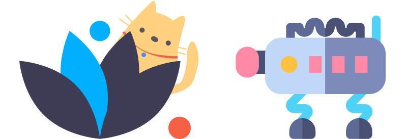
Flat images are popping everywhere. They are becoming more and more popular on the web. They are clean, nice and straigth the point. I use them often in my design. Here are my two favorite examples.
What Flat Design is all about
While many people believe that flat design was born in the era of Microsoft, it started way before the first digital interface was ever built. The roots of flat design are set in Swiss Style. The primary idea of this style was in returning to the basics of craftsmanship — the simplicity of design which is achieved when form follows function. It started in Russia in the 1920s.
Swiss Style and flat design share similar properties — they both focus on the use of grids, clean typography, and excellent visual hierarchy of layout.
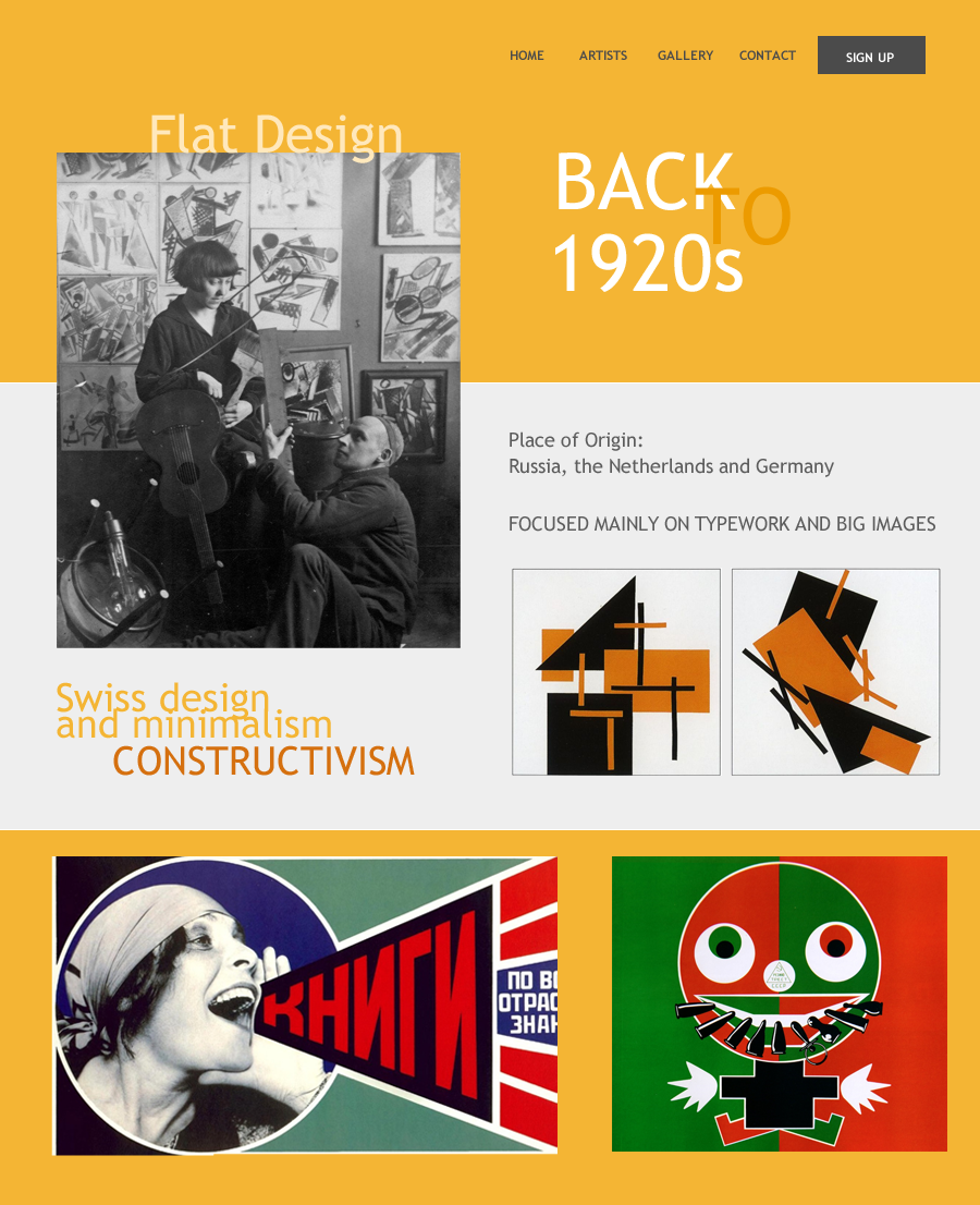
My Flat Design Presentation: Back to 1920s
This is a mockup for my online presentation about the "History of Flat Design." I created the presentation was for an online gallery. I used big fonts, bright contrasting colors and examples of flat design art.
Examples of techniques I use to create flat-art
Beauty and simplicity of creating flat-art
Smiling Face
This is a simple but beautiful example of a modern flat image. I created it by using Adobe XD. You can see the step-by-step process.
Constructivist Shapes
I was inspired to create this flat design by constructivism art from the 1930s. The concepts of constructivism are widely used in modern digital art and UI design.
Flat Icon Art
Creating Flat Icon Art is easy and fun thanks to the many tools for designing icons and thousands of icon libraries available online. Here you can see how I created visually appealing flat images by manipulating icons.
Blocks on Rich Background
Placing blocks with already created flat images on a flat background is another way to create stunning flat images.
Classical Flat Desktop
I use the same technique as in the previous example — blocks on a background.
Flat Images for Mobile
Flat design is perfect for mobile interfaces. Here are examples of my mockups with flat designs in different colors.
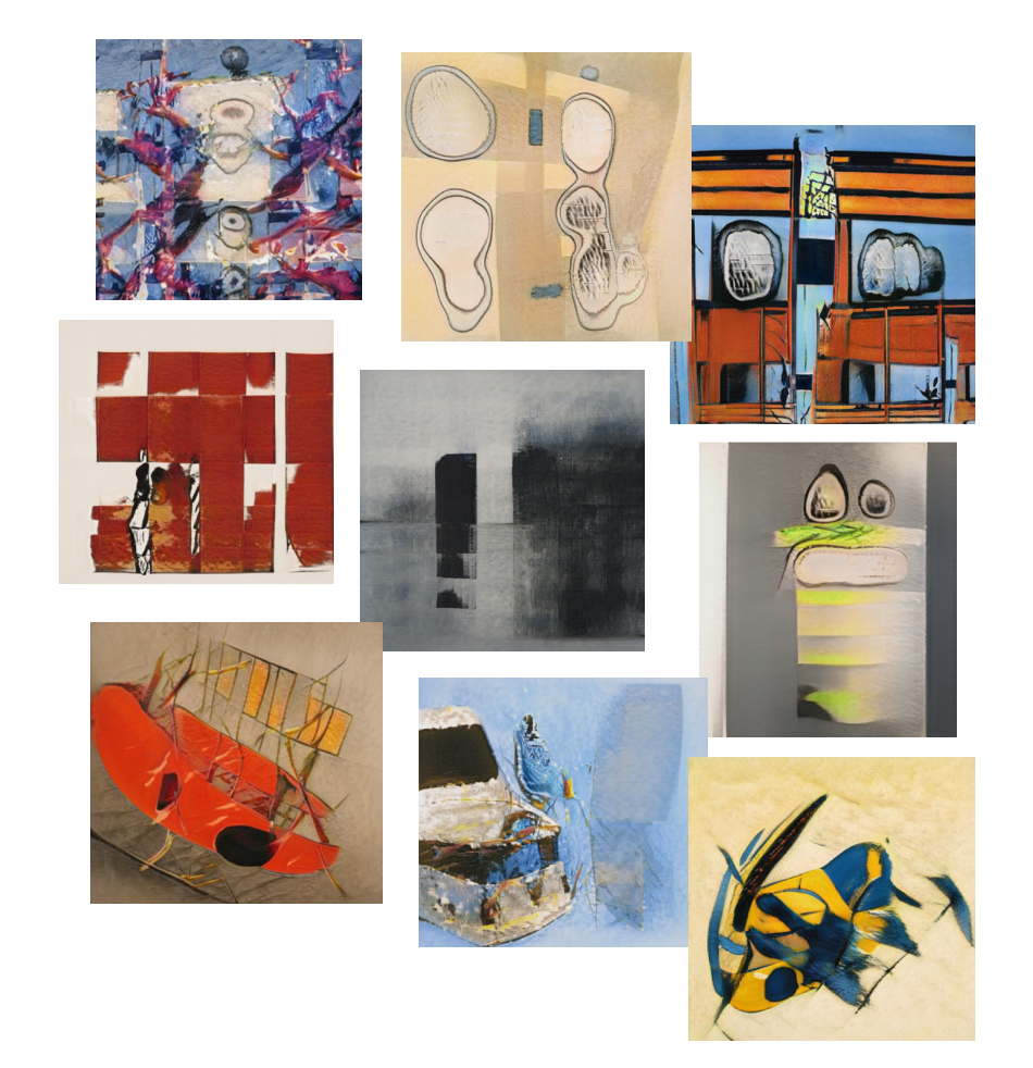
AI-generated art
I played with various AI software for many hours. It was fun. Look what I was able to create with the help of AI.
